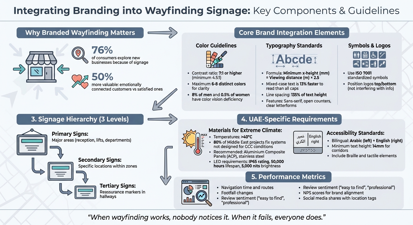
Wayfinding signage is more than just directions; it’s an opportunity to showcase your brand while helping people navigate spaces. By combining functionality with your brand’s visual identity – colours, typography, and symbols – as part of a strong brand identity in the UAE, you can create a system that not only guides but also leaves a lasting impression. This approach can improve user experience, build trust, and even influence business outcomes, as 76% of consumers admit signage has led them to explore new businesses.
Key takeaways include:
- Brand integration: Use colours, fonts, and symbols that align with your identity while ensuring readability and accessibility.
- Modern tools: Interactive kiosks, QR codes, and augmented reality can bridge physical and digital spaces.
- Design essentials: Clear hierarchy, high contrast, and mixed-case text improve visibility and ease of use.
- Durable materials: In the UAE, materials like aluminium and stainless steel withstand harsh weather conditions.
- Accessibility: Bilingual signage, tactile elements, and standardised symbols ensure inclusivity.
A well-designed, branded wayfinding system isn’t just practical – it reinforces brand consistency across all touchpoints, making navigation effortless and memorable.
Essential Components of Branded Wayfinding Systems: Design Guidelines and Best Practices
Core Components of Brand Integration
Brand integration in wayfinding goes beyond simply placing a logo on a sign. It’s built on three fundamental elements: colour, typography, and visual symbols. These elements not only represent your brand but also guide visitors effectively. Together, they form the backbone of a wayfinding system that balances practicality with personality.
Using Brand Colours
Brand colours are a powerful tool for recognition, but in wayfinding, they must also serve a functional role. Contrast is key – while a 4.5:1 ratio meets basic accessibility standards, aim for 7:1 or higher to ensure signs are readable from a distance and in different lighting conditions.
Colour coding can help organise spaces. For example, assign specific brand colours to different areas: one for clinical zones, another for administrative spaces, and so on. However, stick to a maximum of six to eight distinct colours. Too many colours can blur distinctions, particularly for the 8% of men and 0.5% of women with colour vision deficiency.
That said, colour alone isn’t enough. Always pair it with text and symbols to make sure the system works for everyone. Avoid combinations that cause chromatic aberration, which creates a vibrating effect and reduces legibility. Use tools like colour vision deficiency simulators to test your palette and ensure it’s accessible for people with conditions like protanopia, deuteranopia, or tritanopia.
Typography and Visual Hierarchy
Typography plays a critical role in wayfinding. While your brand may have a preferred typeface, wayfinding requires fonts with specific features: sans-serif styles, open counters, and clear letterforms that avoid confusion between characters like “I”, “l”, and “1” when viewed from a distance.
To determine text size, use this formula: Minimum x-height (mm) = Viewing distance (m) × 2.5. For example, if the viewing distance is 10 metres, the x-height should be at least 25mm, which translates to around 36mm for capital letters. Mixed-case text is easier to read – 13% faster than all caps – since the varied shapes of words make them more recognisable.
Establishing a visual hierarchy is equally important. Primary directional signs should be the largest, followed by secondary signs, reassurance markers, and finally room identifiers. On individual signs, group destinations by direction and align text to the left for quicker scanning. Keep line spacing at least 135% of the text height to ensure clarity, especially when viewed at an angle.
Adding Logos and Symbols
Logos and symbols add an extra layer of brand identity. Your logo reinforces trust and familiarity, but placement is key – logos should be positioned at the top or bottom of signs so they don’t interfere with essential information. In the UAE’s multilingual setting, symbols and pictograms are especially valuable. They enable quick understanding across language barriers without relying solely on Arabic or English text.
Use standardised symbols, such as those from ISO 7001, for universal recognition of common facilities like toilets, lifts, and exits. You can customise the sign panels with your brand colours and design elements while keeping the symbols themselves consistent. Materials also matter – solid wood can project warmth and environmental consciousness, while etched stone may convey a sense of heritage and durability. Choose materials that align with your brand’s values and the message you want your space to communicate.
sbb-itb-6cae99a
Analysing Sites and User Needs
To create an effective signage system, you need to understand both the physical space and the people using it. Even the most visually appealing design will fall short if users can’t navigate the area easily. This is why space audits and user behaviour analysis are so important – they ensure signage is a core part of the planning process, not an afterthought.
Space Audits and Physical Context
A space audit involves carefully examining the physical environment to figure out where signage will be most effective. This includes evaluating elements like ceiling heights, lighting conditions, architectural features, and any visual distractions. For example, placing a directional sign near an ornate column or striking artwork might make it blend into the background, reducing its visibility.
Another key consideration is the natural line of sight – the areas where people’s eyes naturally fall as they enter a space or approach a junction. Signs outside this zone might technically be visible but won’t catch attention quickly enough to be helpful. Accessibility is also crucial: a person using a wheelchair has a different perspective than someone standing, and both need to be considered when planning sign placement.
Material choices should complement the space’s character. For instance, dimensional wood or metal might suit a sleek Dubai Marina office, while etched stone could reflect the heritage of a Sharjah museum. These decisions are best made early in the spatial planning process. Adding signage as an afterthought often leads to compromises that can weaken both its functionality and the overall visual impact.
This audit process helps identify the primary navigation challenges within the space.
Identifying User Decision Points
Decision points – places where visitors need to choose a direction – are critical for effective navigation. If signage at these points is unclear or missing, confusion and frustration can quickly follow. Observing how people move through the space can reveal where these crucial moments occur. For example, areas where visitors hesitate, slow down, or ask for directions often signal a lack of clear information.
Mapping out typical visitor journeys is another valuable tool. Consider a hospital: patients entering through the main entrance will need different guidance than those arriving from a car park. Each route highlights specific spots where clear instructions are essential. Similarly, high-traffic areas and potential bottlenecks need well-placed signage that’s easy to see without disrupting movement.
Testing the signage with first-time users can uncover gaps you might have missed. Using straightforward, action-focused language at decision points – like “Follow this path” or “Lift to all floors” – helps eliminate confusion and keeps people moving smoothly. As Root Studio points out, intuitive signage plays a key role in preventing navigation errors and ensuring a seamless user experience.
Creating Branded Wayfinding Systems
Designing a wayfinding system that reflects your brand identity requires a thoughtful approach. It’s not just about guiding users; it’s about ensuring every sign, colour, and material reinforces your visual identity while serving a practical purpose.
Setting Up Signage Hierarchy
A strong wayfinding system relies on a clear information hierarchy, broken into three levels:
- Primary directional signs: These are your largest and most prominent signs, guiding visitors to major areas like reception desks, lifts, or key departments.
- Secondary signs: These smaller signs direct users to specific locations within zones, such as individual rooms or sub-departments.
- Tertiary or reassurance signs: These confirm users are on the right track, especially in long hallways or between key decision points.
To ensure clarity, differentiate sign sizes according to their level in the hierarchy. Stick to the recommended size guidelines to maintain legibility while aligning with your brand’s visual identity. Additionally, group directional options together and use left-aligned text to make scanning faster and easier.
Colour plays a crucial role here, but don’t rely on it alone. Always pair colours with text and pictograms to ensure accessibility for all users. This layered structure not only improves navigation but also subtly reinforces your brand at every touchpoint.
Combining Visual Appeal with Function
Your signage must strike a balance between being visually engaging and highly functional.
“A sign either communicates its message at the required distance, under the actual lighting conditions, to the full range of users, or it does not.”
In short, legibility always takes priority over aesthetics. Even when adhering to strict brand guidelines, clarity is non-negotiable. Use high-contrast colour combinations, like dark text on light backgrounds (or vice versa), with a contrast ratio of at least 7:1. Sans-serif typefaces with open counters and consistent stroke widths are ideal for readability. Also, mixed-case text is quicker to read than all-uppercase, thanks to the distinct word shapes it creates.
Material choice is another way to communicate your brand’s personality. For instance, a modern corporate office might opt for stainless steel or acrylic, while a heritage museum could lean towards etched stone or wood. These materials not only reflect brand values but also add tactile and visual depth, creating what RSM Design calls a “visual kit of parts.” This approach ensures the brand voice is consistent while meeting the practical needs of navigation.
Ultimately, as Kevin Lynch explained, wayfinding should provide “Certainty” through clear labels and arrows, “Variety” through brand-aligned colours and patterns, and “Delight” through unique design touches that leave a lasting impression.
Installation and Ongoing Maintenance
After designing your branded wayfinding system, the next critical steps are installation and regular upkeep to ensure it remains effective. The UAE’s harsh climate – with temperatures often soaring above 40°C, constant UV exposure, sand abrasion, and high humidity – requires meticulous planning. It’s worth noting that around 80% of wayfinding projects in the Middle East involve fixing systems that weren’t initially designed to withstand GCC conditions. Proper execution ensures your design functions as intended while staying aligned with its strategic goals.
Choosing Durable Materials
The materials you select can make or break the longevity and appearance of your signage. For outdoor use, Aluminium Composite Panels (ACP) and stainless steel are excellent choices, as they resist heat, corrosion, and sand abrasion. Steer clear of materials like painted MDF or untreated wood – they simply aren’t built to endure the UAE’s extreme weather conditions.
For illuminated signage, opt for outdoor LED modules with at least an IP65 rating and a lifespan of 50,000 hours (roughly 10–12 years). To ensure visibility in daylight, these LEDs should deliver a brightness of 5,000 nits.
Additionally, don’t overlook the importance of permits. For example, Dubai signboards require DM approval, while road-facing signs need clearance from the RTA. Using tools like Revit or Navisworks during the design stage can help you address sightlines and structural concerns early, avoiding costly adjustments during fabrication.
To maintain your signage’s functionality and appearance, consider an Annual Maintenance Contract (AMC). This keeps your system clean, operational, and aligned with your brand’s image over time.
Meeting Accessibility Standards
While durable materials ensure physical resilience, accessibility standards make your signage usable for everyone.
Accessibility isn’t just a regulatory requirement – it’s an ethical one. Emergency and evacuation signs must adhere to Dubai Civil Defence (DCD) standards, and public facilities should include Braille and tactile elements, especially in healthcare and government buildings.
In a multicultural setting like the UAE, bilingual signage is essential. Public-facing signs must display Arabic on the left and English on the right, with equal emphasis on both languages. Since Arabic reads right-to-left and has unique character proportions, its typography must be carefully designed alongside the English version.
To bridge language gaps, consider an icon-first design. Icons simplify navigation, reduce reliance on text, and address cultural nuances, such as gender-specific wayfinding or prayer-time gathering points.
Visibility is another key factor. High contrast between text and background improves readability in bright daylight, while anti-glare surfaces prevent harsh sunlight from obscuring the text. For corridor signs, a minimum text height of 14mm is recommended to ensure readability, even for those with visual impairments.
For expert guidance, partnering with specialists like Brand Husl can help you meet local regulations, adapt to environmental challenges, and maintain your brand’s consistency across all signage elements. This ensures that your wayfinding system continues to deliver on its promise while reinforcing your brand identity.
Measuring Wayfinding Performance
After setting up and maintaining your wayfinding system, it’s crucial to measure how well it’s working. Performance metrics help confirm whether your investment is paying off, ensuring the signage not only helps visitors navigate but also strengthens your brand presence at every interaction.
Collecting User Feedback
Use tools like touchscreens, QR codes, and NFC technology to gather feedback and identify navigation challenges. These tools can highlight the most-searched destinations, revealing gaps in your static signage.
“Integrating touchscreens, QR codes, and NFC technology allows visitors to interact with the signage directly, obtaining personalised directions or information instantly.” – Panasonic North America
Conduct on-the-ground checks in key locations to ensure your brand colours, symbols, and language are intuitive and not causing confusion. Pay close attention to how long people spend navigating – if visitors are taking unnecessarily long routes or seem lost, it might indicate issues with your signage hierarchy. Regularly collect user data and perform audits to maintain accuracy, readability, and compliance with brand guidelines, even under the UAE’s challenging environmental conditions.
It’s not just about usability; your signage should also reflect and reinforce your brand identity.
Measuring Brand Visibility
To evaluate how well your signage aligns with your brand values, consider using NPS surveys. These can help you gauge whether your visual identity is connecting with your audience.
Track footfall changes after installing new signage. Tools like Square can help monitor physical traffic patterns, while social media platforms like Hootsuite or Sprout Social can track whether users are sharing photos of your signage with location tags.
Additionally, monitor review sentiment on platforms like TripAdvisor and Google Reviews. Look for comments mentioning terms like “easy to find” or “professional appearance” after updates to your signage. On the financial side, compare sales data month-over-month to see if improvements in brand visibility are driving revenue growth.
Conclusion
Integrating branding into wayfinding isn’t just about helping people find their way – it’s about building trust and creating a seamless connection with your audience. When navigation feels effortless, it strengthens your brand image and fosters loyalty. Studies even show that emotionally connected customers can be up to 50% more valuable than those who are merely satisfied.
Great signage does more than point directions; it communicates clearly while reinforcing your brand identity. By using consistent colours, typography, and symbols, your signage becomes a strategic tool, demonstrating professionalism and attention to detail. This turns wayfinding into a meaningful part of the visitor experience, rather than just a functional necessity.
In the UAE, this balance takes on unique challenges. From integrating bilingual content to using materials that can withstand extreme heat, and ensuring cultural sensitivity for diverse audiences, every detail must be carefully considered from the outset.
“When wayfinding works, nobody notices it. When it fails, everyone does.” – Creative Dialog
Before creating any signage, map out visitor journeys and identify critical decision points. Use durable materials, adhere to accessibility standards, and continuously measure performance through user feedback and brand visibility. When done right, your wayfinding system becomes an invisible yet powerful guide – reinforcing your brand and driving lasting loyalty.
FAQs
How do I brand signage without hurting legibility?
When designing branded signage, it’s important to balance branding with readability. Incorporate brand elements like colours, logos, or graphics in a way that complements the design without overshadowing the message. Prioritise typography that remains clear and legible from a distance, using high contrast and strategic placement.
To maintain clarity, position branding elements – such as logos – away from critical text. For example, pair dark logos with light backgrounds to ensure they stand out without distracting from essential information like directional text or symbols. This method strengthens your brand’s presence while ensuring the signage serves its primary purpose effectively.
What’s the best way to plan sign locations and decision points?
Effective planning of sign locations and decision points plays a crucial role in creating a smooth wayfinding experience while strengthening brand identity. Begin by taking a strategic look at the space, examining how visitors move and identifying key destinations. Prioritise placing signs at essential decision points such as entrances, intersections, and areas of transition. To maintain consistency, weave in branding elements throughout the signage. Additionally, considering local cultural nuances and environmental factors ensures the signs are not only practical but also enrich the overall brand experience, particularly within the UAE’s unique context.
Which materials last outdoors in the UAE climate?
Materials that work well in the UAE’s climate need to handle intense sun and high humidity. For posters, UV-resistant and waterproof materials like synthetic paper or laminated finishes are excellent choices. When it comes to metal signage, aluminium stands out as it resists rust and remains durable, even in humid or coastal areas.
Related Blog Posts

BRAND HUSL
We’re a collective of brand strategists, designers, and unapologetic truth-tellers who’ve spent over two decades turning chaos into clarity for businesses across the globe. From global names to fearless startups, we’ve built brands that stick, scale, and sell—without the fluff. Everything we create is rooted in strategy, storytelling, and ROI, because good branding isn’t just pretty—it’s powerful.