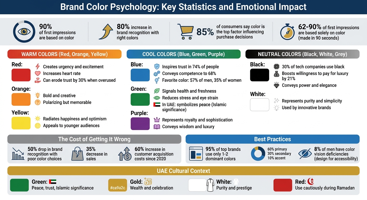
Your brand’s colors are more than just a design choice – they shape how people feel about your business. Studies show that up to 90% of first impressions are based on color, and the right palette can boost brand recognition by up to 80%. But picking the wrong colors can confuse customers or even hurt sales.
Here’s what you need to know:
- Colors evoke emotions: Blue builds trust, red creates urgency, and green signals health.
- Cultural meanings matter: In the UAE, green symbolizes peace, while red can feel aggressive in certain contexts.
- Consistency is key: Use the same colors across websites, packaging, and signage to build trust.
- Test before committing: Different platforms and audiences may interpret colors differently.
Choosing the right colors isn’t just about aesthetics – it’s about aligning with your brand identity in the UAE and connecting with your audience emotionally and culturally.
Brand Color Psychology Statistics and Emotional Impact Guide
The Challenge: Selecting Colors That Match Your Brand’s Vision
Picking the right colours for your brand isn’t just about aesthetics – it’s about strategy and the emotions you want to evoke. The real hurdle? Ensuring those colours align with your business goals while resonating with your audience. For example, a founder might adore orange, but if they’re running a financial services company, that colour could send mixed signals. Clients seeking stability might feel uneasy, ultimately weakening the brand’s message.
The stakes couldn’t be higher. A poorly chosen palette could slash brand recognition by 50% and drop sales by 35%. Meanwhile, 85% of consumers say colour is the top factor influencing their decision to purchase a product. Add to this the fact that customer acquisition costs have surged by 60% since 2020, and it’s clear that colour choices must do more than look good – they need to deliver measurable results. Missteps here don’t just confuse potential customers – they can derail your brand’s overall effectiveness.
Why Brand Colors Matter
Colour isn’t just a visual detail – it’s a psychological trigger. In fact, colour impacts the brain faster than any other visual element. It connects directly to the limbic system, the part of the brain responsible for emotions, meaning it triggers reactions before logic even kicks in. Studies show that between 62% and 90% of a consumer’s first impression of a product is based solely on its colour, and these judgments are made in just 90 seconds.
The numbers speak volumes. Blue, for instance, inspires trust in 74% of people and conveys competence to 68%. Black packaging can boost a consumer’s willingness to pay for luxury items by 21%. On the flip side, overusing intense colours like red can erode trust by 30%. When chosen wisely, colours can increase brand recognition by as much as 80%. That’s why 95% of the world’s most recognisable brands stick to just one or two dominant colours – they understand the power of simplicity and focus.
Common Mistakes in Color Selection
One of the biggest missteps? Letting personal taste drive decisions instead of focusing on what aligns with your business strategy and audience expectations. This approach often leads to a disconnect between the brand and its market. Another frequent issue is using too many colours – more than three or four – and creating visual clutter. This dilutes the emotional impact and confuses your audience.
Businesses also overlook how colours appear across different platforms and materials. A shade that looks flawless on a computer screen might appear entirely off when printed or exposed to natural light. And in a diverse market like the UAE, cultural nuances are critical. White might symbolise purity in Western cultures but represents mourning in parts of Asia. Red, often linked with danger in financial contexts, signifies luck and prosperity in Chinese traditions. Ignoring these cultural associations can alienate key demographics.
Another common oversight is failing to analyse competitors. If your colour scheme blends into a sea of similar palettes within your industry, you lose the chance to stand out while still reflecting the right values. This missed opportunity weakens the emotional connections your brand could establish, undermining its potential impact.
“Colour is not decoration. It is a business signal.” – Haris Ali D., Co-Founder of FullStop
sbb-itb-6cae99a
Understanding Colour Psychology and Emotional Responses
Colour psychology dives into how different hues spark immediate emotional reactions, shaped by both biology and cultural influences. These insights help brands craft a colour palette that not only sets them apart but also connects emotionally with their audience. For example, black often conveys luxury, while blue suggests trust. By aligning a brand’s colours with its emotional objectives, businesses can evoke specific feelings that resonate with their target market. This becomes especially important in the UAE, a region rich in cultural diversity. What appeals to one group may not resonate with another, making it essential to balance universal emotional triggers with cultural nuances. This understanding lays the groundwork for exploring how warm, cool, and neutral tones influence customer perceptions in unique ways.
Warm Colours: Energy and Action
Warm tones like red, orange, and yellow are associated with energy, positivity, and urgency. Red, for instance, has a physiological impact – it increases heart rate and creates a sense of urgency. That’s why it’s often used in call-to-action buttons or flash sale promotions. Coca-Cola uses red to convey excitement and passion, while fast-food brands like McDonald’s pair it with yellow to stimulate appetite and create a welcoming vibe.
Orange stands out for its boldness and creativity, though it can be polarising. Luxury brand Hermès uses it to make a statement in high-end fashion, while Nickelodeon taps into its playful side to appeal to kids. Yellow, on the other hand, radiates happiness and optimism, making it a popular choice for brands targeting younger audiences.
“I asked [my clients] what popped into their head when they looked at different colours, and yellow was overwhelmingly positive. They brought up kindness, warmth, empathy – and that aligned with my brand.” – Kevin Kaminyar, CEO of Yellow Tree Marketing
While warm colours ignite energy, cooler tones evoke a completely different emotional landscape.
Cool Colours: Trust and Calm
Cool tones like blue, green, and purple bring feelings of trust, calm, and professionalism. Blue, in particular, is a go-to choice for logos because it symbolises reliability and competence. Its calming effect explains why platforms like Facebook and companies like Blue Cross Blue Shield rely on it. Fun fact: 57% of men and 35% of women rank blue as their favourite colour.
Green is all about health, freshness, and growth. Known for reducing stress and eye strain, it’s a natural fit for brands like Whole Foods and Starbucks, which focus on wellness and sustainability. Purple, with its ties to royalty and sophistication, is often used to convey wisdom and luxury. However, it requires a careful touch to avoid veering into overly decadent or moody territory. These cooler shades dominate industries like technology, finance, and healthcare, where trust and professionalism are key.
Neutral Colours: Balance and Flexibility
Neutral colours – black, white, and grey – offer a sense of balance and sophistication, often serving as a backdrop to highlight other tones. Black, for example, conveys power and elegance. Around 30% of tech companies incorporate black into their branding. Nike uses it to emphasise strength and performance, while Chanel employs it to exude timeless luxury.
White, on the other hand, represents purity and simplicity. It’s a favourite for innovative brands like Apple and Tesla, which use it to convey modernity and minimalist design. Adidas also leverages white to appeal to a broad audience with its clean, universal aesthetic. Creative Director Hillary Weiss highlights the versatility of neutrals:
“When I think of colour psychology, expectations dictate green for calm or black for high-end. I prefer subverting those cues.” – Hillary Weiss, Creative Director
This adaptability makes neutral tones a powerful tool. They can either follow established conventions or break them entirely, depending on the brand’s strategy and goals.
Solutions: Matching Colours With Brand Values
Matching colours to your brand’s vision isn’t just about aesthetics – it’s about creating a connection that reflects your brand’s personality and resonates emotionally with your audience. Research shows that effective colour choices can increase brand recognition by up to 80%. That’s why it’s so important to align your colours with your brand values and the emotions you want to evoke.
Defining Emotional Goals
Start by identifying your brand’s personality. Is it bold and disruptive? Gentle and caring? Modern and forward-thinking? Or perhaps stable and trustworthy? Once you’ve figured that out, think about the emotions you want your audience to feel. For example:
- Blue or green can signal safety and professionalism.
- Red is often linked to excitement and energy.
- Black or gold can convey exclusivity and luxury.
It’s also worth noting that different demographics perceive colours differently. Younger audiences might be drawn to bright, bold hues, while premium markets often lean towards softer, more understated tones. Understanding your target audience is key. Validate your choices by testing them with your audience, ensuring they work across all platforms – websites, social media, packaging, and more. This consistency builds trust and recognition over time.
Once you’ve set clear emotional goals, you can move on to testing and refining your palette.
Testing and Refining Your Palette
A tried-and-true method for balancing colours is the 60-30-10 rule: 60% primary colour, 30% secondary colour, and 10% accent colour. To maintain consistency across both digital and physical mediums, use precise hex codes (e.g., #151A7B).
Testing is crucial. Use focus groups, A/B testing, and print evaluations to gauge emotional reactions to your palette. Accessibility is another important factor – ensure your colours meet WCAG contrast standards, as around 8% of men and 0.5% of women have colour vision deficiencies. For print designs, transitioning from digital (RGB) to physical (CMYK) can be tricky, but using the Pantone Matching System (PMS) can help maintain accuracy.
Finally, take cultural nuances into account, especially when working in diverse markets like the UAE.
Cultural Sensitivity in the UAE Market
In the UAE, where over 200 nationalities coexist, colours carry different meanings depending on cultural backgrounds. For instance:
- Green holds sacred ties to Islam and symbolises peace and trust. Emirates NBD’s deep green branding reflects this sentiment.
- White signifies purity and prestige, often associated with the Emirati kandura.
- Gold represents wealth and celebration, making it a favourite among luxury brands.
However, cultural sensitivity is key. For example, avoid using red prominently during Ramadan or in religious contexts, as it may come across as too aggressive. Instead, opt for green, white, or gold tones to align with spiritual values.
In September 2025, the UAE Cabinet Office introduced a standardised federal colour palette for national recognition: UAE Gold (#ca9a2c), UAE Green (#006b48), UAE Red (#c8102e), and UAE Black (#232528). Using these colours thoughtfully can enhance local resonance. Always test your palette with diverse groups, including Emirati nationals, Western expats, and South Asian communities, to avoid unintended associations.
At Brand Husl, we specialise in guiding brands through this process, ensuring your colour strategy not only reflects your values but also connects emotionally and culturally with your audience – whether online or in print.
Implementation: Applying Colours Across Brand Touchpoints
With your tested palette ready, it’s time to bring your colour strategy to life across all brand touchpoints. Research shows that up to 90% of snap judgments are influenced by colour, so inconsistent use can weaken your brand’s impact. Consistency is key, and it all starts with building a solid visual identity.
Visual Identity and Design
Your visual identity forms the backbone of your brand. Begin with essential elements like your logo, typography, and imagery. These components should work in harmony to create a unified and recognisable brand experience.
“Brand elements such as typography, imagery, and color really come into play to make sure that you are creating a really strongly branded cohesive experience.” – Sara Mote, Cofounder of Mote web design agency
Establish clear brand guidelines, including exact colour codes (Hex, RGB, CMYK, Pantone), to ensure your colours are applied consistently across all platforms, whether in Dubai, Abu Dhabi, or elsewhere.
Use the 60-30-10 rule to maintain balance: 60% for your primary colour, 30% for a secondary colour, and 10% for an accent. This approach creates a clear visual hierarchy without overwhelming your audience. For digital designs, colour can also guide user interaction by marking states like active, hover, or disabled. Avoid using pure white (#FFFFFF) or pure black (#000000) on screens, as slightly adjusted shades are easier on the eyes. Tools like WebAIM’s Contrast Checker can help you test for accessibility, an important step considering that around 8% of men have colour vision deficiencies.
Digital and Physical Platforms
Whether online or offline, your brand’s colours should deliver a consistent experience. From your website and social media posts to email campaigns, packaging, and signage, every touchpoint should reflect your visual identity.
Take inspiration from brands like Ortega, which uses its signature “airy light blue” to create a calming effect across both digital and physical assets. Similarly, Parachute incorporates a palette of charcoal grey, blush pink, cream, and white to evoke a sense of relaxation.
On digital platforms, accent colours can make all the difference. For instance, a study by CXL revealed that a red call-to-action button outperformed a green one by 21%, boosting conversion rates. On social media, sticking to a consistent palette across posts reinforces brand recognition. For physical elements like packaging and signage, think about how colours will appear in different lighting conditions or busy retail environments. Always test print samples to see how they look in real-world settings before moving to full production.
Brand Husl exemplifies how to seamlessly apply colour strategies across both digital and physical platforms, ensuring their brand messaging stays emotionally impactful.
Conclusion: Building Emotional Connections Through Colours
Colour plays a powerful role in shaping how consumers perceive and interact with brands. In fact, 85% of consumers say colour is the main reason they choose a specific product. This highlights how the right colour choices can inspire trust, evoke excitement, and convey sophistication.
In a multicultural market like the UAE, the stakes are even higher. Here, brands need to balance cultural awareness with emotional appeal. For instance, Emirates NBD uses deep green to symbolise national pride and heritage, while Dubai Expo’s VIP campaigns relied on black and gold to resonate with luxury-focused audiences. These examples show how intentional colour choices can connect with Emiratis, expats, and tourists alike by blending psychological cues with cultural respect.
“Colour isn’t just decoration – it’s psychology, culture, and communication rolled into one.” – Anne Hill, Digital Bee Studio
Consistency is key when it comes to building emotional connections. Whether it’s your website, social media, packaging, or signage, a unified colour palette strengthens your visual identity and boosts customer loyalty.
Mastering colour psychology requires more than just aesthetic sense – it demands careful planning to align emotional goals, accessibility, and cultural relevance. Brand Husl offers branding services tailored to the UAE’s diverse market, ensuring your colour strategy reflects your values and resonates across both Arabic and English platforms. With their expertise, your brand can create a cohesive and impactful presence across all touchpoints.
FAQs
How do I choose brand colours that match my values?
Choosing the right brand colours starts with understanding the emotions and messages you want to communicate. For instance, blue is commonly associated with trust, while green often represents growth and renewal. Think about how these colours connect with your audience and their cultural background. In the UAE, colours can carry particular significance, so it’s essential to consider their local meanings. Your colour palette should complement your brand’s personality and the feelings you aim to evoke.
How can I test colours before launching my brand?
Assessing your brand colours isn’t just about picking what looks good – it’s about understanding their emotional and physiological impact on your audience. Start by using research-based methods like consumer surveys or focus groups. These tools can help you gather direct feedback on how your colour choices influence perceptions and emotions.
Don’t overlook the importance of cultural and regional associations, especially in the UAE. Colours can carry different meanings across cultures, so it’s crucial to ensure your palette resonates with your target audience in this region.
By combining feedback and cultural insights, you can fine-tune your colour palette to ensure it aligns with your brand’s goals before launching.
What colour meanings should I consider in the UAE?
In the UAE, colours such as gold, green, and red hold profound meaning, deeply tied to the nation’s heritage and values. These colours not only inspire trust and connection among residents but also honour the diverse cultural backgrounds of over 200 nationalities living in the country. When selecting colours for your brand, it’s essential to think about how they align with emotional connections and cultural sensitivities.
Related Blog Posts

BRAND HUSL
We’re a collective of brand strategists, designers, and unapologetic truth-tellers who’ve spent over two decades turning chaos into clarity for businesses across the globe. From global names to fearless startups, we’ve built brands that stick, scale, and sell—without the fluff. Everything we create is rooted in strategy, storytelling, and ROI, because good branding isn’t just pretty—it’s powerful.