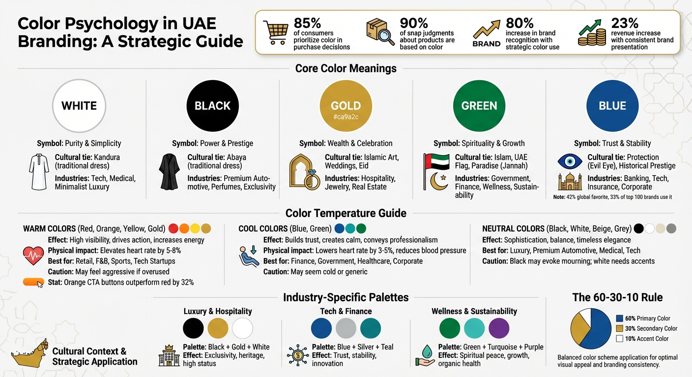
The colors you choose for your brand in the UAE can make or break its success. Why? Because colors aren’t just visuals – they communicate emotions, traditions, and values instantly. In the UAE, where 85% of consumers prioritize color in purchase decisions, understanding the deeper meaning behind hues is crucial. For example:
- Green symbolizes Islam, prosperity, and growth.
- Gold reflects wealth and prestige.
- White stands for purity and simplicity.
- Black conveys power and elegance.
- Blue represents trust and stability.
These meanings are shaped by Islamic values, local traditions, and the UAE’s multicultural population. For instance, while green resonates with Emirati heritage, it also appeals to global eco-conscious trends. Similarly, gold’s luxurious appeal ties to both Islamic art and modern affluence.
If your brand aims to thrive in the UAE, your color choices must align with these emotional and cultural nuances. Whether you’re in luxury, tech, finance, or wellness, the right palette can drive recognition, trust, and loyalty.
Key takeaway: Your brand’s colors should respect local traditions while delivering a clear, modern message. Want to stand out? Combine cultural relevance with global appeal.
Color Psychology Guide for UAE Branding by Industry
Color Meanings in UAE Culture
In the UAE, colours aren’t just visual elements; they carry deep cultural and emotional significance. These meanings are shaped by religion, history, and national identity, making them essential for brands aiming to build a strong brand identity in the UAE. Let’s explore how some key colours resonate within the UAE and their impact on branding.
White: Symbol of Purity and Simplicity
White holds a prominent place in UAE culture, strongly tied to the kandura – the traditional Emirati male attire. This garment represents cleanliness, respect, and honesty, values that naturally extend to branding. White is often used to convey minimalism, clarity, and a sense of sophistication.
In the corporate world, white is a go-to choice for tech and medical brands, as it evokes purity and precision. It also carries a spiritual undertone, being associated with the Ihram garments worn during Hajj. For brands, white offers a balance between tradition and modern elegance, making it a versatile colour for premium aesthetics.
Black: Power and Prestige
Black is a colour of authority and refinement in the UAE, deeply rooted in the cultural significance of the abaya. This traditional garment symbolises modesty and formality, but in branding, black has evolved to represent exclusivity and high status.
Luxury brands, especially those dealing in high-end cars, perfumes, and other premium goods, frequently use black to project a VIP image. When paired with gold or green, black becomes even more powerful, appealing to affluent audiences who value sophistication and exclusivity.
Gold: Wealth and Celebration
Gold is synonymous with luxury and success in the UAE. Its importance comes from Islamic art traditions and its role in festive occasions like weddings and Eid. Gold instantly communicates wealth, achievement, and celebration.
The UAE Design System even includes a specific shade – UAE Gold (#ca9a2c) – to ensure consistent use across government platforms. For existing businesses, a brand audit checklist can help ensure these visual elements remain consistent across all channels. From jewellery to hospitality and real estate, gold is a staple for brands targeting an audience that equates the colour with prestige and prosperity.
Green: Spirituality and Growth
Green holds a special place in UAE culture, symbolising Islam and its connection to paradise (Jannah). It also features prominently in the UAE flag, representing prosperity and national pride. This dual symbolism makes green a powerful choice for brands aligning with both spiritual and patriotic values.
Government bodies, financial institutions, and wellness brands frequently use green to convey peace, growth, and sustainability. With the UAE’s growing focus on eco-friendly initiatives, green is also gaining traction in environmentally conscious branding.
Blue: Trust and Stability
Blue is widely used in corporate and governmental branding in the UAE, thanks to its associations with reliability, security, and calmness. Historically, blue was a symbol of prestige due to expensive dyes like lapis lazuli, and it also holds cultural significance as a protective colour against the evil eye.
Globally, 42% of people consider blue their favourite colour, and 33% of the top 100 brands use it as their primary colour. In the UAE, blue resonates across the multicultural demographic, making it a trusted and professional choice for sectors like banking, insurance, and technology.
Quick Reference Summary
| Colour | Cultural Symbolism | Primary Brand Applications |
|---|---|---|
| White | Purity, kandura, honesty | Minimalist luxury, tech, medical |
| Black | Authority, abaya, formality | Premium automotive, perfumes, exclusivity |
| Gold | Wealth, Islamic art, celebration | High-end hospitality, jewellery, real estate |
| Green | Islam, paradise, UAE flag, growth | Government, finance, wellness, sustainability |
| Blue | Trust, stability, protection (evil eye) | Corporate, banking, tech, insurance |
sbb-itb-6cae99a
Warm vs Cool Colors: Emotional Impact on UAE Brands
Choosing between warm and cool colours isn’t just about how things look – it’s about creating emotional connections that align with your brand’s goals. In the UAE’s highly competitive market, understanding how different colour families influence consumer behaviour can deeply impact how your audience perceives and interacts with your brand.
Warm Colors for Energy and Action
Warm colours like red, orange, and yellow are known for their ability to spark energy and action. Red, for instance, has a short wavelength that speeds up mental processing, often triggering immediate responses. It can even elevate heart rates by 5–8%, making it a go-to choice for creating urgency in retail or stimulating appetite in F&B settings. However, in the UAE, red is usually used sparingly as an accent colour to avoid coming across as overly aggressive.
Orange offers a more balanced approach. It combines 60% of red’s energy with 40% of yellow’s friendliness, making it particularly popular among Dubai’s tech startups and e-commerce brands. In fact, orange call-to-action buttons have been shown to outperform red ones by 32% in e-commerce tests. Meanwhile, yellow, which has the highest visibility among all colours, is perfect for hospitality and youth-focused brands looking to convey optimism and accessibility.
While warm colours energise and drive immediate action, cool colours bring calm and trust into the mix.
Cool Colors for Trust and Calm
Cool colours like blue and green work in the opposite way – they help relax the mind and body. These hues can physically lower heart rates by 3–5% and even reduce blood pressure, creating a sense of safety and calm. Blue, often referred to as the world’s favourite colour, is the top choice for 42% of people globally. In the UAE, it dominates industries like finance, insurance, and technology because it conveys professionalism and reliability. However, overusing blue can make a brand feel generic.
Green, on the other hand, holds a special place in the UAE due to its cultural and religious significance. Beyond its associations with growth and sustainability, green resonates emotionally with local audiences, making it highly effective for government entities, banking, and wellness brands. Cool tones, in general, align well with local values, reinforcing feelings of trust and dependability.
Neutral Colors for Sophistication
Neutral tones like white, black, beige, and grey add a layer of sophistication and balance, acting as a versatile backdrop for other colours. These shades are ideal for brands targeting affluent audiences, as they exude elegance without overwhelming the viewer. For example, luxury brands often use neutral tones as a foundation, letting accent colours create emotional impact without compromising on refinement.
However, there are some nuances to keep in mind. Black, while sophisticated, can have associations with mourning, and white may feel too plain without the right accents. Still, these colours are widely used across industries like luxury, premium automotive, and medical sectors for their timeless appeal.
| Colour Category | Benefits in UAE Branding | Risks/Cautions | Best Industry Fit |
|---|---|---|---|
| Warm (Red, Orange, Yellow, Gold) | High visibility; drives action and appetite; conveys energy and optimism | Overuse may feel aggressive or cheap; red can conflict with certain religious contexts | Retail, F&B, Sports, Tech Startups |
| Cool (Blue, Green) | Builds trust, calmness, and professionalism; green resonates culturally | May seem cold or impersonal; blue is heavily used, risking low differentiation | Finance, Government, Healthcare, Corporate |
| Neutral (Black, White, Beige, Grey) | Adds sophistication, balance, and timeless elegance | Black may evoke mourning; white can lack impact without accents | Luxury, Premium Automotive, Medical, Tech |
For tailored advice on how to use these colour strategies to craft a culturally resonant brand identity, check out Brand Husl (https://brandhusl.com). Their deep understanding of the UAE market ensures every colour choice resonates emotionally and strengthens your brand presence.
Cultural Factors Affecting Color Selection in UAE Branding
Choosing the right colours for a brand in the UAE involves navigating a mix of religious traditions, multicultural influences, and modern design trends. Striking the right balance can help a brand connect meaningfully with its audience, while the wrong choices risk alienating potential customers.
Religious and Historical Context
Islamic traditions play a significant role in shaping colour preferences across the UAE. Colours like green, white, gold, and black carry deep spiritual and cultural meaning. Brands often tap into these associations strategically:
- Green: Symbolises trust and prosperity, making it a go-to choice for finance and government branding.
- White: Represents honesty and purity, frequently used in luxury and medical sectors.
- Gold: Evokes prestige and opulence, ideal for hospitality and real estate.
- Black and Gold: Together, they signal high-end exclusivity, particularly in premium markets.
Seasonal branding also aligns with religious observances. For example, during Ramadan, brands adopt palettes featuring green, white, gold, and deep purples to reflect the period’s spiritual tone. In contrast, bold or aggressive colours like red are avoided, as they can clash with the reflective nature of the season.
Multicultural Audience Considerations
With over 200 nationalities living in the UAE, the country’s population embodies a rich diversity of cultural perceptions around colour. A single hue can evoke vastly different emotions based on someone’s cultural background.
For instance:
- Green: While it signifies environmental sustainability for many Western expats, it holds profound religious and national significance for Emiratis.
"The UAE’s multicultural reality means these considerations aren’t academic – they’re practical design challenges we face daily." – UAE Design System
Brands must carefully balance Emirati heritage with the expectations of South Asian, Western, and other GCC expats. This often involves creating adaptable designs where core branding elements remain consistent, but colour intensity or supporting visuals are adjusted to resonate with specific communities.
Additionally, relying solely on colour to communicate important information can be risky in such a diverse market. Incorporating icons, text labels, and patterns ensures clarity. The UAE Design System, for example, requires a minimum contrast ratio of 4.5:1 for normal text, ensuring accessibility and trust across all demographics.
Modern Trends and Sustainability
While traditional values heavily influence colour choices, modern trends like sustainability and digital accessibility are shaping branding strategies in the UAE. Sustainability, in particular, has become a major focus as the nation works towards Vision 2030 goals. Green has taken on a dual role – honouring Islamic traditions while signalling environmental awareness and wellness. This makes it especially effective for brands blending heritage with progressive values.
Dubai’s reputation as a "city of the future" has popularised colours like blue, silver, and white in tech and innovation sectors, reflecting clean technology and forward-thinking ideals. At the same time, startups catering to Gen Z and millennials are leaning towards bold, high-saturation palettes inspired by social media platforms like Instagram and TikTok.
With a tech-savvy population, brands are also optimising for digital formats, focusing on dark mode compatibility and high-contrast designs to maintain functionality and trust.
The secret lies in balancing tradition with modernity. For example, incorporating Islamic geometric patterns or traditional motifs with minimalist palettes or modern gradients can honour cultural sensitivities while appealing to contemporary tastes. For brands navigating these complex cultural dynamics, Brand Husl (https://brandhusl.com) offers expert insights into crafting colour strategies that resonate across the UAE’s diverse market.
How to Select Brand Colors for the UAE Market
Selecting the right colours for your brand in the UAE is about more than just looking good – it’s a strategic decision that blends cultural awareness with your business goals. Research indicates that colour influences 85% of purchase decisions and enhances brand recognition by up to 80%. Clearly, your choice of colours can have a significant impact.
Define Your Brand’s Emotional Goals
The first step in choosing your brand colours is understanding the emotions you want to evoke. Each colour carries its own psychological message. For instance:
- Blue symbolises trust and professionalism, making it a strong choice for industries like fintech and insurance.
- Black and gold exude exclusivity and luxury, often used in high-end hospitality and real estate.
- Green has special meaning in the UAE, reflecting Islamic heritage and modern sustainability efforts.
However, some colours require extra thought. Red, for example, can create energy and urgency in retail but may feel too intense during spiritual periods like Ramadan. During these times, opting for colours such as green, white, gold, or deep purples can align better with the reflective mood. The key is to balance aesthetics with cultural relevance.
Analyse Your Target Audience
The UAE’s market is incredibly diverse, so understanding your audience is crucial. Are you targeting Emirati nationals, who value tradition and quality, or are you appealing to the expatriate community, which might lean towards a more global and contemporary aesthetic?
Cultural context matters. For example, green might signify environmental awareness to Western expats but holds religious significance for many Emiratis. Geographic preferences also come into play:
- Dubai tends to favour bold, modern, and international styles.
- Abu Dhabi often leans towards conservative and formal designs.
- Sharjah emphasises cultural heritage and modesty.
Moreover, keep accessibility in mind. Around 8% of men and 0.5% of women experience colour blindness, so avoid relying solely on colour to convey important information. Adding icons or text labels ensures clarity for everyone.
Once you’ve defined your audience, the next step is ensuring your chosen colours remain consistent across all platforms.
Maintain Consistency Across All Platforms
After establishing emotional and audience goals, focus on technical precision. Colours can appear differently on screens, print materials, and signage, so it’s vital to specify exact codes like HEX, RGB, CMYK, and Pantone. Consistency matters – a brand consistency across all touchpoints can boost revenue by up to 23%.
A helpful guideline is the 60-30-10 rule:
- Use your primary colour for 60% of applications.
- Apply a secondary colour for 30%.
- Reserve an accent colour for the remaining 10%.
Make sure your palette works well with both Arabic and English typography (as typography choice significantly impacts brand perception) and is legible in both light and dark modes. Also, test how your colours look under different lighting conditions. A shade that seems perfect on a laptop screen might appear dull or washed out under Dubai’s bright sunlight.
For a seamless colour strategy across all touchpoints – digital platforms, packaging, signage, and more – Brand Husl offers tailored brand guidelines to ensure your colours deliver a consistent experience every time.
Color Palettes by Industry in the UAE
Tailoring colour palettes to specific industries amplifies brand appeal in the UAE. Each sector relies on colour psychology to connect with its audience while respecting local traditions. Using a brand color palette finder to choose the right colours isn’t just about aesthetics – it’s about evoking emotions that align with your industry’s core values and customer expectations.
Luxury and Hospitality
In the UAE, black and gold dominate luxury branding, blending global sophistication with local prestige. Gold symbolises wealth and regional significance, while black conveys authority and exclusivity. Adding white to the mix brings a sense of purity and high status, reflecting the traditional Emirati kandura.
"Black + gold combination particularly powerful (black sophistication + gold regional prestige)." – PGX Agency
For a striking effect, pair gold with dark shades like black or deep emerald. Use white as a backdrop to emphasise cleanliness and minimalist elegance. Purple is also gaining traction in the UAE’s luxury sector, combining the energy of red with the calm of blue – a perfect choice for boutique hotels or high-end spas. This palette supports a sense of exclusivity and tradition, resonating deeply with UAE audiences.
Tech and Finance
Blue remains a cornerstone for tech and finance branding, symbolising professionalism, trust, and reliability. Traditional banks often opt for deep blue paired with white or grey to communicate stability. On the other hand, fintech startups are shaking things up with vibrant gradients, purple, and teal, signalling innovation and modernity.
Green holds a special place in the UAE’s financial sector due to its cultural and religious significance. For instance, Emirates NBD incorporates deep green to reflect heritage and trustworthiness. High-end tech brands lean towards silver and black for a sleek, modern look. When targeting Emirati nationals, incorporating green or white can enhance cultural resonance.
Wellness and Sustainability
Green is the go-to colour for wellness and sustainability brands, symbolising nature, health, and growth. Its religious importance further strengthens its appeal. Pair green with turquoise or teal to highlight innovation in health, or combine it with white for an organic, pure aesthetic.
Purple works particularly well for wellness brands centred on transformation, suggesting creativity and spiritual insight. High-end wellness services, like luxury spas, often use deep purple with gold and black to convey indulgence and exclusivity. For sustainability-focused brands, earthy tones like sandy beige and terracotta connect to the UAE’s desert landscape and heritage, creating a natural and authentic identity.
| Industry | Recommended Palette | Psychological Effect in UAE |
|---|---|---|
| Luxury & Hospitality | Black, Gold, White | Exclusivity, heritage, and high status |
| Tech & Finance | Blue, Silver, Teal | Trust, stability, and innovation |
| Wellness & Sustainability | Green, Turquoise, Purple | Spiritual peace, growth, and organic health |
Conclusion
Colour plays a powerful role in shaping consumer perception in the UAE, influencing decisions within seconds. Studies reveal that 90% of snap judgments about products are based on colour, and 85% of consumers identify it as their top factor when making a purchase. With a population representing over 200 nationalities, selecting the right colour palette requires professional insight to ensure it resonates effectively.
The UAE’s unique blend of Islamic heritage, multicultural influences, and forward-thinking modernity calls for a thoughtful approach to colour choices. Shades like green, gold, and white hold deep cultural and historical significance that can either elevate or hinder brand recognition. In fact, strategic use of colour can boost brand recognition by up to 80%.
Experts emphasise the importance of blending cultural understanding with strategic design.
"In the UAE and Dubai, color psychology is more than design it’s strategy." – Ecem Gülbeniz, Graphic Design Team Leader, Pella Global
Precision is just as critical as cultural awareness. Consistency across all brand touchpoints – whether digital platforms or physical packaging – ensures a cohesive identity. Research shows that consistent brand presentation can increase revenue by 23%, which you can measure using a brand consistency checker, but this requires accurate colour representation across HEX, RGB, CMYK, and Pantone standards. When cultural insights meet technical accuracy, brands set the stage for lasting success.
FAQs
Which brand colours work best for Emiratis vs expats in the UAE?
In the UAE, selecting brand colours requires a thoughtful approach to align with the cultural and emotional preferences of the audience. Among Emiratis, green, white, and gold hold special significance. Green reflects Islam, white symbolises purity, and gold represents luxury – together, these colours evoke trust and a deep sense of national pride.
For the expatriate community, preferences can differ. Blue is often associated with trust and professionalism, making it a popular choice for corporate and formal branding. On the other hand, warmer tones like red and orange bring a sense of energy and approachability, appealing to a more dynamic and friendly vibe. By tailoring colour choices to these distinct preferences, brands can effectively connect with the UAE’s diverse population.
How can I use green in the UAE without looking too “government”?
To steer clear of a "government" feel when incorporating green in the UAE, lean into themes like wellness, nature, and sustainability. Opt for vibrant or earthy green tones that evoke health and environmental awareness. Avoid using institutional shades, as they may feel too formal. Instead, focus on colours that reflect cultural preferences and help craft a modern, friendly brand identity.
How do I keep my brand colours consistent across print, signage, and digital?
To keep your brand colours consistent across print, signage, and digital platforms, it’s important to have a well-thought-out colour strategy. Start by creating a unified colour palette that reflects your brand identity while considering the local context and audience preferences. Clearly define your colour codes – such as HEX, RGB, and CMYK – and include these in your brand’s style guidelines.
Make sure these standards are applied across all materials and platforms, from brochures to websites. Regularly reviewing your materials and seeking expert advice when needed can help ensure your colours remain consistent and relevant to your audience.
Related Blog Posts

BRAND HUSL
We’re a collective of brand strategists, designers, and unapologetic truth-tellers who’ve spent over two decades turning chaos into clarity for businesses across the globe. From global names to fearless startups, we’ve built brands that stick, scale, and sell—without the fluff. Everything we create is rooted in strategy, storytelling, and ROI, because good branding isn’t just pretty—it’s powerful.