Your logo is often the first impression of your brand, making it essential to get it right. A strong logo is simple, scalable, and timeless, conveying your brand’s identity and values at a glance. In the UAE, where businesses operate in a multicultural and competitive market, a well-designed logo can bridge linguistic and cultural divides, fostering trust and recognition.
Key Takeaways:
- Logo Types: Choose from wordmarks, letterforms, monograms, abstracts, emblems, or combination marks based on your brand’s needs and audience.
- Typography: Fonts reflect personality – serif for trust, sans-serif for modernity, script for elegance, and display for impact. Limit to two typefaces for clarity.
- Colour: Colours influence perception – gold for luxury, green for growth, blue for trust, or use a brand color palette finder for more options. Ensure high contrast for accessibility.
- Scalability: Test your logo at all sizes, from tiny favicons to large billboards. A versatile design ensures clarity across formats.
- Design Process: Start with research, sketch ideas, refine digitally, and test across applications. Always maintain consistency.
A professional logo is an investment in your brand’s future, ensuring it resonates with your audience and stands out in a crowded market. Whether you’re targeting Emirati nationals or expats, the right design principles will help your logo leave a lasting impression.
Types of Logos and When to Use Them
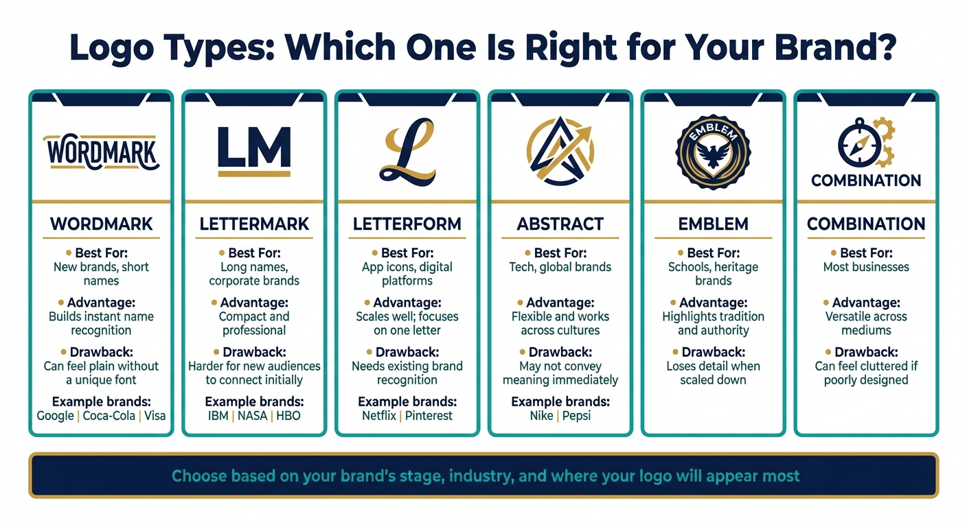
Logo Types Comparison: Best Uses, Advantages and Drawbacks
Picking the right logo type plays a key role in shaping how customers perceive and build a strong brand identity in the UAE. Each style serves a unique purpose, from boosting instant name recognition to conveying symbolic meaning that transcends language barriers. This is especially important in a multilingual market like the UAE, where visual elements must appeal across cultures and platforms.
Wordmark and Letterform Logos
Wordmark logos rely entirely on typography, showcasing your business name in a distinctive font. Think of Google, Coca-Cola, or Visa. If your business name is short and easy to remember – preferably one or two words – a wordmark helps build strong name recognition.
Letterform logos focus on a single letter, turning it into a recognisable symbol. Examples include Netflix’s “N” and Pinterest’s “P.” These logos are highly effective but depend on prior brand recognition – customers need to already associate the letter with your business.
“There is power in owning a letter of the alphabet: it’s universal and instantly identifiable as shorthand for our brand.” – Netflix
Now, let’s look at how monogram and abstract logos offer alternative visual strategies to meet different branding needs.
Monogram and Abstract Logos
Monogram logos (also known as lettermarks) use initials or acronyms to simplify longer business names. Companies like IBM, NASA, and HBO use this approach. If your business name is lengthy or challenging to pronounce, a monogram ensures clarity, even on smaller items like business cards or promotional materials.
Abstract logos use shapes or patterns instead of recognisable images. Nike’s swoosh and Pepsi’s circle are classic examples. These logos symbolise brand values without being tied to specific products, making them ideal for businesses looking to expand into new areas. In diverse markets like the UAE, abstract logos work well because they avoid cultural misinterpretations.
Other types, such as emblems (which combine text and imagery within a defined shape, often used by schools or legacy brands) and combination marks (which blend text with symbols), offer unique advantages. These are outlined in the table below.
Logo Type Comparison
Here’s a quick breakdown of the different logo types, their uses, strengths, and limitations:
| Logo Type | Best For | Advantage | Drawback |
|---|---|---|---|
| Wordmark | New brands, short names | Builds instant name recognition | Can feel plain without a unique font |
| Lettermark | Long names, corporate brands | Compact and professional | Harder for new audiences to connect initially |
| Letterform | App icons, digital platforms | Scales well; focuses on one letter | Needs existing brand recognition |
| Abstract | Tech, global brands | Flexible and works across cultures | May not convey meaning immediately |
| Emblem | Schools, heritage brands | Highlights tradition and authority | Loses detail when scaled down |
| Combination | Most businesses | Versatile across mediums | Can feel cluttered if poorly designed |
When choosing a logo type, think about where it will be most visible. For instance, if you’re launching a mobile app, a letterform logo works well for small-scale clarity. On the other hand, businesses targeting the UAE’s diverse audience might benefit from abstract or combination logos, which communicate effectively across languages and cultures without relying heavily on text.
sbb-itb-6cae99a
Typography in Logo Design
Typography plays a crucial role in expressing your brand’s personality. The fonts you select send immediate messages about your values – whether your brand leans more towards being traditional or modern, playful or formal, approachable or authoritative.
Font Categories and Their Uses
Different font categories evoke different emotions. Serif fonts, with their small decorative lines at the ends of strokes, are often associated with tradition, trust, and professionalism. For example, many financial institutions use serif fonts to communicate integrity and authority. ING’s serif font reinforces these qualities, but when tested with a modern sans-serif alternative, the brand appeared more contemporary – though it lost some of the trust and tradition it aimed to highlight.
Sans-serif fonts, on the other hand, are clean and free of decorative elements. Their simplicity conveys modernity, clarity, and precision, making them a favourite for tech companies and digital platforms. They’re especially effective for screen readability across devices. Script fonts, which mimic handwriting with fluid, connected strokes, suggest sophistication and elegance. However, their readability can suffer at smaller sizes. Display fonts stand out with bold, decorative designs, perfect for making a dramatic impact in headlines or large-scale applications. Lastly, handwritten fonts bring a casual, artisanal feel, ideal for brands seeking a friendly and approachable image. For example, Haribo’s custom sans-serif font uses rounded, bold shapes to project playfulness and appeal to families.
Beyond font styles, font weight also influences perception. Bold fonts are great for conveying strength and ensuring visibility, while lighter fonts can feel delicate or even feminine. Letter shapes matter too – sharp corners grab attention, while rounded edges feel more inviting.
With these categories in mind, here are some practical tips for refining your font choices.
Tips for Choosing and Using Fonts
To keep your logo clean and effective, stick to no more than two typefaces. If you use two, aim for high contrast – pairing a serif with a sans-serif, for example, can create a harmonious balance. With so many fonts available, it’s important to match your choice to your brand’s personality while ensuring readability.
Pay attention to kerning and tracking – the spacing between letters. Adjusting these ensures uniformity, prevents awkward gaps, and gives your logo a polished, balanced look. Always test readability at various sizes to ensure your design works across different applications.
“Choose faces that suit the task as well as the subject.” – Robert Bringhurst, Author, The Elements of Typographic Style
Avoid following fleeting trends if you want a logo that stands the test of time. While minimalist and custom designs are trending now, sticking to timeless principles ensures your logo remains relevant as styles evolve. Custom fonts, while offering a unique identity, can be expensive – ranging from AED 36,700 to over AED 367,000. For most brands, well-chosen licensed fonts can achieve excellent results at a fraction of the cost.
If you’re looking for expert advice on selecting typefaces that reflect your brand’s identity, Brand Husl can help ensure your logo resonates with your audience in the UAE.
Once your typography is finalised, you can move on to explore how colour psychology in graphic design can enhance your logo’s overall impact.
Color Theory and Its Application
Colour is more than just a visual element – it’s a powerful tool that combines psychology, culture, and communication. In logo design, colour plays a dual role: it grabs attention and communicates your brand’s identity. Interestingly, the brain processes colour faster than it does shapes or text. In fact, 90% of instant product evaluations and 85% of purchase decisions are influenced by colour. So, picking the right colours is a key step in creating an effective logo.
Let’s dive into the basics of colour relationships to understand this better.
Color Theory Fundamentals
Grasping basic colour relationships can help you design logos that feel intentional and visually appealing.
- Complementary colour schemes: These pair colours opposite each other on the colour wheel, like blue and orange. They create a striking contrast, making them ideal for brands in retail or youth-focused industries where grabbing attention is crucial.
- Analogous colour schemes: These use colours that sit next to each other on the wheel, such as blue and teal. The result is a cohesive, polished look that feels premium and unified.
Before adding colour, ensure your logo works in black and white. This guarantees it remains recognisable in all formats. Keep in mind that about 8% of men and 0.5% of women have colour vision deficiencies, so high-contrast designs are essential for accessibility.
Color Psychology in Branding
In the UAE, colour psychology is shaped by its multicultural population, Islamic values, and a market that thrives on luxury and innovation. Here’s how some key colours resonate in the region:
- Green: A symbol of Islam, paradise, and growth, green also represents national pride. It’s a top choice for sectors like finance, healthcare, and government.
- Gold: Known as UAE Gold (#ca9a2c), this colour signifies wealth, success, and heritage. It’s a staple for high-end jewellery, hospitality, and real estate brands.
- Black and Gold: This combination has become synonymous with luxury in Dubai, especially in fashion and automotive branding.
- Blue: Associated with trust and stability, blue dominates corporate and fintech branding. However, since 33% of top brands already use it, pairing it with warmer tones can help avoid a cold or impersonal feel.
- White: Representing purity and respect, white is often linked to the traditional Emirati kandura. It works well for tech and luxury brands.
- Red: Evoking energy and urgency, red is best used sparingly as an accent. Excessive use during Ramadan, for instance, can come across as overly aggressive or culturally insensitive.
Here’s a quick overview of colours and their cultural meanings in the UAE:
| Colour | UAE Cultural Meaning | Recommended Industries |
|---|---|---|
| UAE Gold (#ca9a2c) | Prosperity, luxury, success | Jewellery, real estate, hospitality |
| UAE Green (#006b48) | Islam, peace, growth, healing | Finance, healthcare, government |
| UAE Red (#c8102e) | Energy, urgency, importance | Food & beverage, emergency services |
| UAE Black (#232528) | Elegance, power, modernity | Luxury automotive, perfumes, VIP services |
By understanding these cultural nuances, you can craft a colour palette that amplifies your logo’s message.
Building a Brand Color Palette
A well-thought-out colour palette not only boosts brand recognition but also ensures your logo performs effectively across various platforms. The ideal palette typically includes:
- Primary colour: Used for 60% of the design.
- Secondary colours: Covering 30%.
- Accent colours: Making up the final 10%, often for calls-to-action.
Studies show that strategic use of colour can enhance brand recognition by up to 80%. Plus, consistent branding across platforms can lead to a 23% increase in revenue.
When creating your palette, test contrast early. Make sure your combinations meet WCAG 2.2 level AA contrast standards, which require at least a 4.5:1 ratio for normal text. For example, avoid using UAE Gold (#B68A35) as a background for text; instead, opt for #92722A to meet accessibility requirements. Blend traditional elements like Arabic aesthetics with modern touches such as gradients and geometric patterns. During Ramadan, brands often lean into gold, green, and deep purples to reflect the spiritual and festive atmosphere.
If your business targets the UAE’s diverse demographic – including Emirati nationals, Western expats, and South Asian communities – resources like Brand Husl can guide you in developing a colour palette that resonates across cultural lines while maintaining accessibility.
Once your colour palette is ready, the next step is ensuring your logo maintains its impact, no matter the size or medium.
Testing for Scalability and Versatility
When crafting a logo, it’s not just about how it looks on your screen – it needs to shine across every platform and size. From tiny smartwatch icons and Instagram profiles to massive billboards along Sheikh Zayed Road, your logo must stay clear and impactful. A design that looks great on a laptop might lose its charm when shrunk to a favicon or blown up for event signage at the Dubai World Trade Centre.
Start by testing your logo in its simplest form: black and white. Strip away gradients and colours to see if the core design communicates your brand effectively. If it doesn’t hold up in monochrome, it might struggle in applications like embossing on luxury packaging, engraving corporate gifts, or printing on textured materials like newsprint.
“A versatile logo is a silent ambassador. It looks equally strong whether it’s the size of a postage stamp or a highway billboard.” – Gean Ribeiro, Buzzvel
Once the monochrome test passes, move on to scaling. Check how your logo performs at both extreme ends of the size spectrum:
- Small scale: Shrink your logo to business card size (about 2.5 cm) or favicon dimensions (16×16 pixels). Is the text still readable? Do fine details disappear? For smaller applications, you might need to tweak letter spacing or increase font weight to maintain clarity.
- Large scale: Blow it up to 3 metres tall, as it would appear on an exhibition stand. Are the edges sharp? Does it grab attention from a distance?
To ensure flexibility, create a family of logo variations instead of relying on a single design. For example:
- A full logo with an icon, wordmark, and tagline works well for websites and printed materials.
- A stacked version fits square spaces like social media profiles.
- An icon-only mark is ideal for mobile app icons or WhatsApp avatars.
- For the smallest formats, like favicons or smartwatch displays, use a micro mark – just a bold shape or letter that remains recognisable even at tiny sizes.
In the UAE, logos often appear with premium finishes like gold foil stamping, embossing, or embroidery, especially in hospitality and luxury retail. These techniques demand simplified, high-contrast monochrome designs. Make sure your logo maintains strong contrast on both light and dark backgrounds. Use SVG files for digital platforms to ensure they scale perfectly, and high-resolution PDF or EPS files for print.
If you’re designing for the UAE’s multicultural and diverse audience, your logo needs to adapt seamlessly across various touchpoints – from Ramadan event branding to year-round packaging. For expert guidance in creating a responsive logo system that works everywhere, check out Brand Husl.
The Logo Design Process
Designing a logo involves a step-by-step approach that takes you from understanding your brand’s essence to delivering a polished visual identity with the help of a trusted design agency. By blending typography, colour theory, and scalability, this process ensures your logo not only looks great but also resonates with your audience. Whether it’s a startup in Dubai or a luxury hotel in Abu Dhabi, a structured approach guarantees a design that’s both strategic and memorable.
Research and Concept Development
Before diving into design, it’s crucial to define the brand’s mission, values, and purpose. Start by creating a mind map of the brand’s key pillars. For instance, designing for a luxury hotel in the UAE might focus on themes like heritage, elegance, and personalised service.
Next, analyse both local and global competitors. This research helps you identify trends while ensuring your logo stands out. For example, if every café in your area uses script fonts and coffee bean icons, you’ll know to explore a unique direction. Once you’ve gathered your insights, summarise them into keywords and visual concepts. Use mood boards filled with fonts, colours, and styles to set the tone and align everyone involved before the actual design work begins.
“Logo design process demands a combination of investigation, strategic thinking and design excellence.” – Alina Wheeler, Author of Designing Brand Identity
With a clear vision in place, you can move on to sketching and exploring visual ideas.
Sketching and Refining Designs
Start with 50–100 hand-drawn sketches to freely explore ideas without being limited by design software. Experiment with both symbols and wordmarks during this phase.
From these sketches, choose the strongest concepts and digitise them using vector tools like Adobe Illustrator. Working in black and white initially ensures that the design’s structure and form hold up without relying on colour.
Once the digital versions are refined, apply them to real-world mockups. This helps you assess how the logo performs in practical scenarios.
Creating Mockups and Final Testing
Test your logo concepts by placing them on real-world applications like business cards, packaging, website headers, and social media profiles. For example, ensure the logo remains legible when scaled down to a 16×16 pixel favicon or when displayed on both light and dark backgrounds.
Evaluate the logo’s adaptability across various formats, from tiny favicons to large exhibition banners, and gather feedback. Ask questions like, “What stands out first?” and “What impression does this logo give about the brand?”
After testing, finalise the design by exporting it in multiple formats (AI, EPS, SVG, PNG, and PDF). To maintain consistency, create a style guide that includes details like colour palettes, typography, spacing, and usage rules. Whether it’s for Ramadan campaigns or everyday branding, this guide ensures the logo always looks its best.
Principles for Effective Logo Design
Creating a great logo isn’t about following every design trend or adding unnecessary flair. It’s about capturing the essence of your brand in a way that’s simple, relevant, and consistent. These three pillars ensure your logo works seamlessly across all platforms – whether it’s a tiny 16×16 pixel favicon or a massive billboard on Sheikh Zayed Road.
Simplicity and Memorability
The most effective logos are pared down to their essentials. Simplicity makes it easier for the brain to process and remember, allowing your audience to instantly recognise your brand. By focusing only on what’s necessary and removing distractions, your logo becomes adaptable – working just as well on a business card as it does on large-scale signage.
“A logo doesn’t sell (directly), it identifies.” – Paul Rand
A memorable logo doesn’t need words to make an impression. Think of the most iconic logos – they’re instantly recognisable because of their clean, unique designs. This memorability comes from thoughtful decisions: distinctive shapes, intentional colour choices, and straightforward forms. Avoid relying on trends like 3D effects, gradients, or shadows, as these can make your logo feel outdated or overly complex. A timeless logo is one that remains impactful without these embellishments.
Relevance and Timelessness
A strong logo not only keeps things simple but also tells your brand’s story in a way that stands the test of time. It should reflect your core values without being tied to fleeting design trends. A logo that works in black and white is a great indicator of its versatility, especially in a diverse market like the UAE, where it may need to resonate across multiple languages and cultural contexts.
Chasing design fads can lead to logos that quickly feel outdated, resulting in costly redesigns. Instead, focus on creating a logo with meaning beyond aesthetics. Use negative space creatively, select fonts that mirror your brand’s personality (serif fonts for a classic feel, sans-serif for a modern vibe), and design with longevity in mind. Your logo should grow with your brand, not be left behind as trends shift.
Consistency Across All Materials
Consistency is key to building a recognisable brand. Studies show that 25% of consumers are more likely to buy from a business whose logo they recognise, and that recognition comes from maintaining a uniform look across all platforms. Whether it’s your Instagram profile or a storefront in Dubai Marina, every instance of your logo should reinforce the same professional image.
To achieve this, create a detailed brand style guide. This guide should outline the proper use of your logo, including clear space requirements, standardised typography, and file formats for different applications – SVG for social media, transparent PNGs for digital use, and high-resolution PDF or EPS for print. Test your logo on various backgrounds (white, dark, and image-based) to ensure it’s always visible. And most importantly, avoid common mistakes like stretching, flipping, or altering colours, as these practices weaken your brand’s impact.
At Brand Husl, we prioritise consistency in branding to ensure that every element of your visual identity aligns perfectly. By following these principles, your logo will not only stand out but also remain cohesive and effective across all mediums.
Conclusion
A well-designed logo is more than just an image – it’s the essence of your brand, distilled into a single, recognisable mark. Throughout this guide, we’ve explored the key components that make a logo effective: understanding the different types of logos, leveraging typography and colour theory, ensuring scalability, and following a structured design process. When combined, these elements create a logo that’s clear, memorable, and adaptable across all platforms.
Consider this: consumers form their first impression of a brand in just 10 seconds, and it takes 5–7 interactions for them to remember it. That means your logo needs to leave a strong impact, whether it’s on a tiny 16×16 pixel favicon or a massive billboard along Sheikh Zayed Road. Every detail counts.
While DIY tools might seem like a quick fix, only professional designers can translate your vision into a logo that stands the test of time. A professional doesn’t just create something visually appealing – they ensure the design aligns with your brand strategy, uses vector formats for technical precision, employs colour and shapes with psychological intent, and even handles legal clearance to protect your brand. This kind of expertise ensures your logo performs consistently and effectively, no matter where it appears.
At Brand Husl, we go beyond just designing logos. We offer a full suite of branding services, from audits and strategy development to implementing your identity across signage, packaging, and digital platforms. With a deep understanding of the UAE market, we tailor our approach to the region’s unique cultural and business dynamics, ensuring your brand resonates with its audience.
If you’re ready to create a logo that truly represents your brand, it’s time to work with experts who combine strategic thinking with design precision. A well-thought-out logo isn’t just a design choice – it’s a step towards building trust and recognition with your audience for years to come.
FAQs
How do I pick the right logo type for my business?
When selecting the ideal logo type, think about your brand’s personality, the message you want to convey, and the audience you aim to reach. Explore various styles, like brandmarks or pictorial logos, which use visuals to represent your brand and leave a quick, lasting impression.
Pay attention to how effectively the logo communicates your key message. It’s also essential to ensure the design works across different platforms and media formats, so it aligns seamlessly with your business requirements.
What colours work best for UAE audiences?
Colours that connect with UAE audiences often mirror local values and emotional ties. Green, for instance, is associated with growth and prosperity, while gold evokes feelings of luxury and affluence. Using bright, vibrant colours can grab attention, but it’s crucial to respect cultural nuances and the setting in which they’re used. By aligning your colour choices with these preferences, you can create visuals that leave a lasting impression and build a meaningful bond with your audience.
Which logo files do I need for print and digital use?
When it comes to print, opt for vector formats like EPS or AI. These formats are scalable, making them perfect for high-resolution printing without losing quality. For digital purposes, use PNG files with transparent backgrounds for websites and social media. For general online applications, JPEG files work well. These choices help ensure your logo looks sharp and consistent across all platforms.
Related Blog Posts

BRAND HUSL
We’re a collective of brand strategists, designers, and unapologetic truth-tellers who’ve spent over two decades turning chaos into clarity for businesses across the globe. From global names to fearless startups, we’ve built brands that stick, scale, and sell—without the fluff. Everything we create is rooted in strategy, storytelling, and ROI, because good branding isn’t just pretty—it’s powerful.