Animated logos are no longer optional – they’re essential for standing out in the UAE’s competitive digital markets like Dubai and Abu Dhabi. They transform static designs into memorable, engaging experiences, helping your brand connect with audiences faster. With 89% of businesses using video marketing, animated visuals have proven to leave a stronger impression than static ones.
Here’s a quick breakdown of how to get it right:
- Timing Matters: Keep animations short and platform-specific. For instance, app loading screens should be under 2 seconds, while social media posts can last 3–5 seconds.
- Consistency Across Platforms: Stick to your brand’s colours, typography, and movement styles to ensure brand consistency across all touchpoints, including websites, social media, and apps.
- Simplicity Wins: Focus on one key movement or element to avoid overwhelming viewers. Use easing techniques to make transitions smooth and natural.
- Show Personality Through Motion: Choose motion styles that align with your brand – fluid for trust, dynamic for energy, or deliberate for stability.
- Optimize for Platforms: Use the right file formats like Lottie for apps or MP4 for social media, and test animations on all screen sizes and devices.
Core Principles for Logo Animation
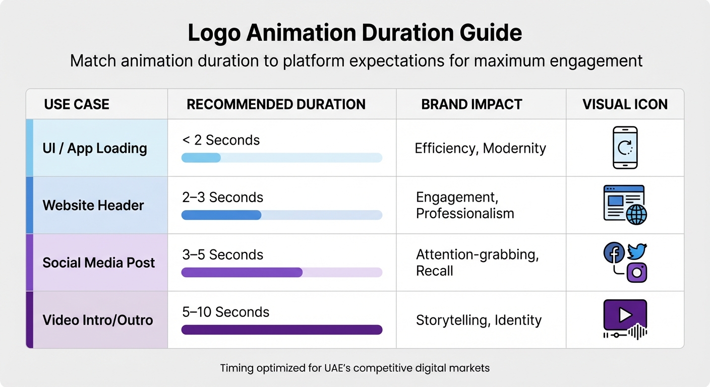
Logo Animation Duration Guide by Platform and Use Case
Logo animation is built on three key ideas: timing, consistency, and simplicity. These work together to make sure your animated logo enhances your brand without overwhelming it.
Timing and Duration
How long your animation lasts plays a big role in keeping viewers engaged. It’s important to match the animation’s duration with what users expect on different platforms, especially in competitive markets like Dubai and Abu Dhabi.
For example, animations for app loading screens should be under 2 seconds to give quick feedback. Website header animations can stretch to 2–3 seconds to draw interest without slowing things down. Social media posts perform well with animations lasting 3–5 seconds, offering just enough time to grab attention and leave an impression. For video intros and outros, aim for less than 10 seconds to keep viewers hooked.
“Twenty-second logo intros are a sure way to lose your viewers’ attention.” – Fivecube
The speed of movement in your animation also says a lot about your brand. Fast, sharp motions suggest energy and innovation, while slow, smooth transitions feel more elegant and trustworthy. For instance, established brands might prefer slower movements for a sophisticated feel, while playful brands can lean into quicker, more dynamic transitions.
| Use Case | Recommended Duration | Brand Impact |
|---|---|---|
| UI / App Loading | < 2 Seconds | Efficiency, Modernity |
| Website Header | 2–3 Seconds | Engagement, Professionalism |
| Social Media Post | 3–5 Seconds | Attention-grabbing, Recall |
| Video Intro/Outro | 5–10 Seconds | Storytelling, Identity |
Once timing is nailed down, the next focus is keeping your visuals consistent across platforms.
Visual Consistency
With timing sorted, it’s crucial to maintain your brand’s design integrity. Stick to your brand toolkit essentials – this includes using a consistent colour palette (ideally 2–3 core colours), typography that matches your brand tone, and adapting designs to fit different platform formats. For example, a vertical version might suit TikTok or Reels, a square version works well on Instagram, and a widescreen version is ideal for YouTube.
Consistency in motion is just as important. When your logo uses the same movement patterns across platforms, it strengthens the connection between that motion and your brand identity. Many teams create motion style guides to document details like timing, easing, and transitions, ensuring a unified look across all applications.
Testing your animation on various screen sizes is also essential. If small details get lost on smaller screens, simplify the design by reducing the number of moving elements. Starting with high-resolution vector files (like SVG) ensures your animation stays sharp, whether it’s displayed on a smartphone or a massive billboard.
Once your visuals are consistent, simplicity becomes the final piece of the puzzle.
Simplicity and Focus
After perfecting timing and consistency, keep things simple. Overloading your animation with too many elements can confuse viewers and weaken your brand message.
“Less is more when it comes to animations. More elements mean more visual clutter and more confusion.” – Clay
Every movement should have a purpose and align with your brand story. For instance, a logo that assembles itself can represent growth, while one with morphing elements can suggest flexibility. Focus on a single, primary element to draw attention, using secondary features sparingly to support the overall design.
Use easing – gradual acceleration and deceleration – to make transitions feel smooth and natural. Ensure that all text and icons remain clear and readable throughout the animation. Keep in mind that online, you have about 8 seconds to capture someone’s attention, and it often takes 5–7 impressions for your brand to stick in their memory. Make every second of your animation count.
sbb-itb-6cae99a
Using Motion to Show Brand Personality
Building on timing, consistency, and simplicity, the way your logo moves can amplify its personality even further. The motion of your logo speaks volumes about your brand values, just like its colours and typography do. In visually competitive markets like Dubai and Abu Dhabi, the right motion style can help your brand stand out almost instantly. Let’s dive into how specific motion styles and easing techniques can reinforce your brand’s personality.
Motion Types and Brand Messaging
Different motion styles trigger different emotional responses. Here’s how they align with brand messaging:
- Fluid, smooth transitions: These convey warmth, trust, and elegance, making them a great fit for industries like financial services or healthcare. They project calmness and reliability.
- Fast, dynamic movements: Quick transitions and bouncy animations communicate energy, innovation, and playfulness. Perfect for tech startups or entertainment brands looking to showcase their creativity.
- Rigid, deliberate movements: Slower, more calculated motions with a sense of visual weight suggest stability and professionalism. This style works well for B2B enterprises or luxury brands.
“Motion is not decoration. It is part of your identity. It shows how your brand behaves, how confident it feels, and how it wants to be seen.” – Our Code World
Forward motion often evokes a sense of optimism and progress, while simple cuts keep things purposeful and natural. The timing of your motion should also match your logo’s perceived weight. For example, heavier logos should move more slowly and settle firmly to communicate stability, while lighter, playful logos can bounce or fade quickly. Since humans are naturally drawn to movement, animated logos tend to leave a stronger impression than static ones.
Now, let’s explore how easing techniques can make these movements feel more engaging and natural.
Easing and Natural Movement
Easing techniques – how motion accelerates and decelerates – are key to making animations feel lifelike rather than mechanical. Avoid linear motion in favour of easing curves that mimic real-world physics. These subtle adjustments make movements more relatable and engaging.
For instance, Slack applies classic animation principles like staging and anticipation in their “animation constitution.” They avoid character-by-character text animations to maintain clarity and a purposeful tone. Similarly, Klarna reflects their “Smoooth” brand promise by using Material Design 3 easing curves, steering clear of motion blur to keep their identity sharp and modern.
Many professional brands rely on established easing techniques to maintain consistency and reduce cognitive fatigue across platforms. Techniques like anticipation (preparing the viewer for an action) and overshoot (a slight bounce-back effect) add a playful touch without feeling overdone. For example, Indeed uses movement that is “quick, intentional, and well-choreographed.” Their UI elements expand and shrink subtly, creating a helpful and approachable feel that aligns with their mission to support job seekers.
Technical Setup and Platform Optimization
Once you’ve nailed down the creative details, the next step is fine-tuning the technical setup to ensure your brand’s animations look great and perform well across all platforms.
After finalising your motion style and easing preferences, make sure your animations are optimised for each platform. Using the wrong file format can slow down loading times, which is especially problematic in regions like the UAE, where users expect smooth and efficient digital experiences. The goal isn’t just about maintaining high quality – it’s about ensuring your brand appears consistently, whether it’s on Instagram, your website, or an iPhone.
File Format Selection
Each platform has its own requirements, and choosing the right file format can save you a lot of hassle. Here’s a quick breakdown of the most effective formats:
- Lottie (JSON): Perfect for web and mobile apps, this format is lightweight, scalable, and vector-based. Complex animations that might take up megabytes as video files can often be reduced to just a few kilobytes with Lottie.
- MP4 (H.264): Ideal for social media platforms like Instagram, TikTok, and YouTube intros, this format delivers high-quality playback but doesn’t support transparency.
- WebM (VP9): Best for web hero sections, this format supports high-quality video with an alpha channel, making it great for animations that need transparency.
- HEVC MOV: Designed for iOS and macOS, this format provides transparent video playback optimised for Apple devices.
- GIFs: While useful for email signatures and chat platforms due to universal autoplay support, GIFs have limitations like larger file sizes and reduced colour depth compared to newer alternatives.
- SVG: Ideal for simple, responsive web animations, SVG files remain sharp at any screen size and are lightweight.
Pick the format that aligns with your animation’s needs and the platform’s specifications to maintain a consistent brand identity.
Platform-Specific Adjustments
Optimising for different platforms doesn’t mean starting from scratch – it’s about making smart tweaks. For example, when using WebM files on websites, include the HTML <video> tag with attributes like autoplay, loop, muted, and playsinline to ensure compatibility across browsers. Stick to the recommended animation durations to meet user expectations for each platform.
Always test your animations on smaller screens to ensure your brand name and visuals remain clear, especially since the UAE’s digital audience is largely mobile-first. Prepare versions for both light and dark backgrounds, and include static PNG or SVG fallbacks for users with “reduced motion” settings or for environments where scripts are disabled. Hosting your files on a Content Delivery Network (CDN) ensures faster loading times globally, while compressing files before deployment keeps performance high without sacrificing quality.
Visual Hierarchy in Animation
Building on the core principles of timing, consistency, and simplicity, visual hierarchy ensures that your animated logo doesn’t just move – it moves with purpose. Animation becomes a tool to guide the viewer’s focus, highlighting key brand elements. Since moving elements naturally draw more attention than static ones, motion becomes a powerful way to direct the eye. When animating your logo, you’re essentially crafting a journey for the viewer’s gaze, and that journey must feel deliberate. By following visual hierarchy principles, you can strategically guide attention where it matters most.
Start by identifying your primary focal point – the element that should grab attention first. This could be your brand name, a logo icon, or a defining shape. This focal point sets the tone, while other elements should support it rather than compete. A brilliant example is Pixar Animation Studios’ iconic sequence featuring Luxo Jr. The hopping lamp lands on the letter “I”, immediately drawing attention to the centre of the brand name while injecting a sense of imagination and playfulness.
To keep animations clean and engaging, use staggered sequences. This means animating elements one at a time – like fading, sliding, or rotating in succession – to avoid overwhelming the viewer. The World Wildlife Fund (WWF) achieves this beautifully with their panda logo. The simplicity of its black-and-white design lends itself to smooth animations, such as the panda walking or waving. These subtle movements bring the logo to life while maintaining its minimalist structure.
Timing is another key element of visual hierarchy. Quick transitions can convey energy and innovation, while slower fades suggest trust and reliability. Discord’s recent brand update is a great example. By removing the speech bubble frame around their mascot Clyde, they allowed the character to move more freely across digital platforms. This shift emphasised Clyde as the main focal point of the animation, reinforcing its importance in the brand identity.
“A great animated logo does more than move; it communicates. In seconds, it expresses your brand’s energy, humor, or sophistication, creating an instant emotional connection.” – Masko.ai
Finally, test your animation across different sizes to ensure the visual hierarchy remains intact, especially on mobile devices. This is particularly crucial when you build a brand identity in the UAE, where mobile-first digital experiences dominate. If smaller screens cause details to become unclear, reduce the number of animated elements. Additionally, stick to two or three brand colours to avoid clutter, and ensure that any text or logos remain legible throughout the animation sequence.
Final Checklist
Before launching, make sure your animated logo aligns with your brand identity and works seamlessly across all platforms.
Start with your brand foundation. Use your core brand principles to identify three key personality traits – like playful, professional, or minimal – that will shape the tone and rhythm of your animation. Every movement should reflect these traits. For instance, a bounce can convey approachability, while a smooth morph might suggest flexibility. Stick to 2 to 3 brand colours to keep the design clean, and ensure your typography and icons are consistent with your static branding.
Optimise for technical performance. Begin with a vector file (SVG or AI) with a transparent background to avoid quality loss when scaling. Export your animation in these formats: MP4 for social media, WebM for websites, GIF for email signatures, and MOV with Alpha for video editing. Keep UI animations under 2 seconds and video intros between 2 to 4 seconds to grab attention quickly without overstaying their welcome.
Test across devices. Preview your animation on both desktop and mobile screens, especially since mobile-first experiences are key in the UAE. Ensure text is readable at every frame, even when scaled down for small navigation bars. For accessibility, include a static fallback for users with “reduced motion” settings, so your brand’s presence remains visible no matter the circumstances.
Finally, ensure consistency by documenting your animation rules. Create motion guidelines that detail easing curves, timing, and transition rules. This will provide a reference for future projects, ensuring your animated logo remains a cohesive part of your brand identity. With these steps, your animated logo will effectively communicate your brand’s energy and personality in just a few seconds, leaving a lasting impact.
FAQs
How do I choose the right motion style for my brand?
To pick the right animation style, match it with your brand’s personality and core values. For instance, brands with a fun and lively image might lean towards energetic and dynamic motion graphics. On the other hand, more formal or professional brands may opt for clean, understated animations. Whatever you choose, make sure the style stays consistent across all platforms. This helps visually convey your brand’s essence and creates a memorable impression.
Which logo animation file format should I use for each platform?
When choosing animation formats for different platforms, consider their strengths:
- Websites: Use MP4, GIF, or Lottie JSON. Lottie JSON stands out for its lightweight and scalable nature, making it perfect for web animations.
- Social Media and Digital Platforms: MP4 and GIF are your go-to options, as they are widely supported across various platforms.
- Vector-Based Designs: For high-quality, scalable animations, SVG is the best choice.
Each format has its place: MP4 and GIF cover most platforms, Lottie JSON excels in web animations, and SVG is ideal for vector-based designs.
How can I keep my animated logo fast, clear, and accessible on mobile?
To make your animated logo work seamlessly on mobile devices, focus on a few key areas: file size, animation simplicity, and responsiveness. Start by using lightweight formats like SVG, and compress files to ensure faster loading. Keep animations straightforward – smooth, minimal movements are best for maintaining clarity. Lastly, test your logo on different screen sizes to guarantee it scales well and remains accessible across all devices.
Related Blog Posts

BRAND HUSL
We’re a collective of brand strategists, designers, and unapologetic truth-tellers who’ve spent over two decades turning chaos into clarity for businesses across the globe. From global names to fearless startups, we’ve built brands that stick, scale, and sell—without the fluff. Everything we create is rooted in strategy, storytelling, and ROI, because good branding isn’t just pretty—it’s powerful.