Trust starts with design. In the UAE’s fast-evolving financial sector, where 329 fintech companies compete for attention, a brand’s visual identity plays a key role in building trust. With 85% of the population being expatriates from over 200 nationalities, financial brands must balance clarity, bilingual designs, and compliance with Islamic finance principles. Studies show that consistent branding can increase revenue by up to 23%, while 72% of institutional investors say polished visuals strongly influence their first impressions.
Key takeaways:
- Emirates NBD: Combines heritage and modernity. Its green palette resonates locally and globally, contributing to a 12% income increase in 2025.
- Liv Bank: Bold, vibrant designs appeal to younger users. Personalised interfaces and immersive tech earned it awards like Digital Bank of the Year 2024.
- Brand Husl: Focuses on strategy-first branding for financial institutions, ensuring alignment across platforms while addressing "brand drift."
Consistency across channels is essential. From logos to app interfaces, every touchpoint must align to build confidence. Even minor inconsistencies – like mismatched colours or outdated formats – can harm trust. Financial brands in the UAE must prioritise clear, compliant, and unified designs to stand out in a competitive market.
1. Emirates NBD
Logo and Iconography
Emirates NBD emerged from the merger of two iconic institutions: the National Bank of Dubai, the UAE’s first national bank established in 1963, and Emirates Bank International. The logo reflects this union, combining arc elements from both banks to symbolise shared heritage and partnership. This design choice underscores the bank’s identity as a state-owned institution supported by the Dubai government, ensuring a foundation of stability and trust.
The iconography goes beyond tradition, capturing the bank’s transition into digital leadership. With 97% of its financial transactions now happening outside physical branches, the logo serves as a bridge between its historical roots and modern innovation. This dual focus is essential in meeting customer demands for both reliability and cutting-edge convenience. Emirates NBD’s brand value of USD 4.54 billion and its position as the 6th most valuable bank on Forbes Middle East’s 2025 list highlight how effectively this visual identity resonates.
Colour Palette
The bank’s deep green is more than just a colour – it’s a nod to cultural significance. In the UAE, green is tied to Islamic values, peace, and nature, making it a powerful connection with local audiences while also projecting strength and tradition globally. Studies reveal that colour can boost brand recognition by up to 80%, and Emirates NBD’s use of green helps it stand out in a competitive market.
The results speak for themselves. In the first half of 2025, the bank reported a 12% income increase, reaching AED 23.9 billion. Additionally, its net promoter score climbed by six points – from 43 to 49 – within a year. This demonstrates how a carefully chosen colour palette can shape customer perception and drive loyalty.
Consistency Across Channels
Emirates NBD’s commitment to a cohesive brand experience was evident during the rollout of its merged identity. Over just two months, the bank ensured its new visuals were seamlessly integrated across 826 branches and 4,555 ATMs worldwide. This consistency extended to digital platforms, marketing materials, and in-branch experiences, ensuring customers encountered the same identity wherever they interacted with the bank.
Ahmad Humaid Al Tayer, Chairman of Emirates NBD, remarked:
"The Emirates NBD brand reflects and reinforces our position as a leading banking group in the region. It is testament to the strategy of our management team and the strength of the bank’s core businesses."
Operating in 13 countries and serving over 9 million active customers, the bank’s unified branding fosters instant recognition and builds trust. In a fast-evolving digital banking world, this level of consistency strengthens customer loyalty and reinforces Emirates NBD’s reputation as a leader in financial services.
sbb-itb-6cae99a
2. Liv Bank
Logo and Iconography
Liv Bank uses its logo as more than just a brand marker – it’s an integral part of its design language across both digital and physical platforms. The logo is prominently featured on sleek, premium black payment cards, creating a smooth connection between online and offline experiences.
The bank also tailors its iconography to cater to different age groups. For example, Liv Lite, designed for children, incorporates an AI-generated 3D "in-app buddy", while Liv X offers a more sophisticated design for older users. This evolving design strategy not only adapts to users’ changing needs but also fosters long-term familiarity with the brand. With a growing user base of over 500,000 in the UAE, this thoughtful evolution of visual elements reflects Liv Bank’s focus on building trust and connection throughout different life stages.
Colour Palette
Liv Bank breaks away from the traditional navy and grey tones often associated with banking. Instead, it opts for bold, vibrant colours that resonate with the energy and creativity of the UAE’s younger generation. Drawing inspiration from modern art and fashion, Liv Bank’s palette reflects its forward-thinking approach.
The app goes a step further by offering five distinct design themes, each with its own colour accents, giving users the freedom to personalise their banking interface. This attention to personalisation aligns with consumer expectations – 71% of users want tailored interactions, and 76% feel frustrated when those expectations aren’t met.
Liv Bank also made waves at the Dubai FinTech Summit in May 2024, where it introduced its "Liv X Spatial" banking experience for the Apple Vision Pro. This immersive platform featured a colour scheme that mirrored the Liv X app, enhanced by 3D assets to create a gallery-like environment. This bold visual strategy earned Liv Bank the Red Dot Award 2025 for "Interface & User Experience Design", underscoring how its vibrant and adaptable design sets it apart in the industry.
Consistency Across Channels
Liv Bank’s commitment to a cohesive visual identity is evident across all its platforms. From the minimalist, vibrant payment cards to the seamless interface of the Liv X app and immersive spatial banking experiences, every touchpoint reinforces the brand’s modern and trustworthy image.
As a digital-only bank, Liv benefits from the established reputation of its parent company, Emirates NBD, while carving out its own identity with an uplifting and distinct design system. Pedro Sousa Cardoso, Chief Digital Officer of Retail Banking and Wealth Management at Emirates NBD, highlighted this focus:
"As banking and financial services become increasingly digital, Liv addresses the need for simple, secure, and accessible transactions. With digital-first products, Liv offers UAE customers innovative banking solutions powered by technology."
Liv Bank’s dedication to a unified visual presence hasn’t gone unnoticed. It was named Digital Bank of the Year in MENA 2024 and Virtual Bank of the Year in UAE 2024. These accolades demonstrate how a consistent and engaging visual identity can build trust, even in a fully digital banking environment.
3. Brand Husl
Logo and Iconography
Brand Husl takes a strategy-first approach, focusing on building trust and credibility before diving into visuals. With over 20 years of experience, they’ve developed the "7-Figure Branding Framework", which centres on making brands relevant, different, and credible. This approach proved effective in 2025 when they were tasked by the Dubai Financial Services Authority (DFSA) to modernise its visual identity. The challenge? Balancing a fresh, updated look while maintaining its reputation as a trusted financial regulator.
Their strategic focus extends beyond visuals. For DIFC Courts, they crafted a brand narrative around the theme "Don’t stop when your legacy begins", using iconography and logo design to convey stability and legal authority. Similarly, they worked with the Africa Legal Network (ALN) to unify branding across multiple jurisdictions, ensuring a cohesive identity that instills confidence in international financial clients.
Consistency Across Channels
Brand Husl understands that consistency is key to building trust. Drawing inspiration from the branding success of Emirates NBD and Liv Bank, they ensure every element of a brand aligns with its core strategy. Their five-step process – audit, strategy, design, guidelines, and implementation – creates a seamless brand experience. Research supports this approach: consistent branding can boost revenue by up to 23%, while design systems can cut marketing production costs by 30% to 50%.
To tackle "brand drift" – when a brand’s visuals no longer reflect its scale or ambitions – Brand Husl conducts thorough audits. They review everything from pitch decks to product interfaces, ensuring a unified look and tone. Their "Look & Feel" guidelines cover logos, colour schemes, and even details like data visualisation standards. As they put it:
"Most failed branding comes from skipping strategy and going straight to visuals. We fix that – by starting with positioning, not decoration."
Strengths and Weaknesses
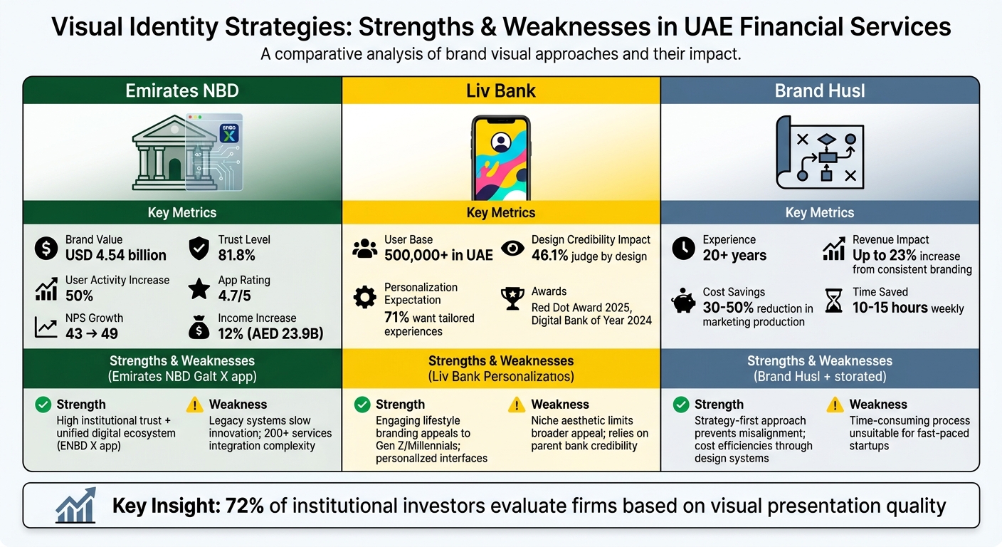
UAE Financial Brands Visual Identity Strategy Comparison
Visual identity strategies in financial services come with both advantages and challenges.
Emirates NBD has built its visual identity on a foundation of institutional trust. The launch of its unified ENBD X app, which brought together previously scattered services, resulted in a 50% increase in user activity and earned a strong 4.7 rating. However, integrating over 200 services into a single platform has proven to be a significant hurdle, with legacy systems slowing down the pace of innovation.
On the other hand, Liv Bank has effectively connected with younger, tech-savvy audiences through its bold yellow-and-black branding and personalised design elements. This approach highlights how design influences trust – 46.1% of users gauge a website’s credibility based on its design. However, its heavy reliance on established credibility might limit the broader appeal of its niche aesthetic.
Finally, Brand Husl focuses on a strategy-first approach, avoiding the common mistake of prioritising decoration over proper brand positioning. Their method, which includes detailed audits and structured brand toolkit, ensures a consistent visual identity and can result in cost savings. That said, this thorough process may not align with the rapid timelines required by fast-moving startups.
| Approach | Key Strength | Primary Weakness |
|---|---|---|
| Emirates NBD | High trust levels (81.8%) and a unified digital ecosystem | Legacy systems hinder innovation; integrating 200+ services is complex |
| Liv Bank | Engaging lifestyle branding that appeals to Gen Z and Millennials | Niche aesthetic may limit broader appeal; depends heavily on existing credibility |
| Brand Husl | Strategy-focused process prevents misalignment and offers cost efficiencies | Time-consuming process may not suit fast-paced startup environments |
These examples demonstrate how thoughtful visual identity strategies can shape user trust and engagement across different financial service models.
Conclusion
A financial brand’s visual identity is far more than just aesthetics – it’s about building trust. Emirates NBD, Liv Bank, and Brand Husl demonstrate how consistent design across all touchpoints can establish credibility. On the flip side, mismatched visuals – like a sleek mobile app paired with an outdated PDF statement – can erode trust in an instant. Even the smallest inconsistencies matter.
These examples highlight the importance of a cohesive and strategic visual approach. For financial brands in the UAE, creating a balance between standing out and being reliable is key. Every piece of communication, from your website to compliance documents, should reflect a unified design. Implementing robust design systems – beyond static guidelines – can help marketing teams save significant time (10–15 hours weekly) and cut production costs by up to 50%. Reusable components ensure consistency as your team grows, as seen in the successful strategies from the case studies.
Accessibility and compliance should also be priorities. Adhering to WCAG 2.1 standards for colour contrast and meeting CBUAE requirements for fee and exchange rate transparency are non-negotiable. Test your logo and typography at all scales, from tiny favicons to Bloomberg terminal sidebars, to ensure they remain clear and legible.
Lastly, governance plays a pivotal role. Without regular reviews – ideally every quarter – visual identities can lose their impact within 12–18 months as teams resort to "close enough" templates. In a competitive market where 72% of institutional allocators evaluate asset managers based on presentation, maintaining a consistent visual identity doesn’t just build trust – it directly supports revenue growth.
FAQs
What design elements make a financial brand feel trustworthy in the UAE?
Trustworthy financial brands in the UAE prioritise clean and professional visual identities that align with local regulatory requirements. They focus on clear, multilingual communication to cater to the UAE’s diverse population. Additionally, their user interfaces are crafted with safety and reliability in mind. By maintaining consistent design elements and providing transparent information, these brands strengthen customer trust.
How do we keep visuals consistent across apps, PDFs, ATMs, and branches?
To maintain a cohesive and professional presence, create a detailed visual identity system accompanied by clear brand guidelines. These guidelines should define essential elements like logos, colour palettes, typography, and graphic styles. Applying these consistently across all platforms – whether it’s an app, a PDF document, an ATM interface, or branch signage – eliminates the need for on-the-fly decisions. This uniformity strengthens brand recognition, fosters trust, and ensures every interaction reflects the same identity.
How can a brand stay modern without breaking compliance or Islamic finance expectations?
A brand can stay current while aligning with compliance and Islamic finance principles by combining modern aesthetics with traditional values. This might involve adopting refreshed logos, designs optimised for digital platforms, and incorporating culturally resonant elements like geometric patterns or symbolic colours. Such an approach allows brands to project innovation and reliability, all while honouring Islamic principles. This balance helps them engage effectively with their audience and remain competitive in an ever-changing financial sector.
Related Blog Posts

BRAND HUSL
We’re a collective of brand strategists, designers, and unapologetic truth-tellers who’ve spent over two decades turning chaos into clarity for businesses across the globe. From global names to fearless startups, we’ve built brands that stick, scale, and sell—without the fluff. Everything we create is rooted in strategy, storytelling, and ROI, because good branding isn’t just pretty—it’s powerful.