Rebranding isn’t just a cosmetic update – it’s a way for companies to redefine their identity, connect with new audiences, and align with changing business goals. From Apple dropping "Computer" to focus beyond tech to Dunkin’ shifting its spotlight to beverages, successful rebrands solve real business challenges. Here’s a quick look at seven standout examples:
- Apple: Dropped "Computer" in 2007 to reflect its expansion into music, phones, and more. Result? A brand value jump from $6.6 billion (2001) to $98.3 billion (2013).
- Dunkin’: Simplified its name in 2018, focusing on coffee and beverages, leading to a 4.2% sales boost in the first year.
- Starbucks: Removed "Coffee" from its logo in 2011, broadening its reach into tea, food, and global markets.
- Old Spice: Revamped its image with the 2010 "The Man Your Man Could Smell Like" campaign, doubling body wash sales.
- Burberry: Reclaimed its luxury status by scaling back its iconic check pattern and focusing on timeless designs, boosting share prices by 22.4% in 2024.
- Airbnb: Introduced the "Bélo" logo in 2014, shifting from accommodations to fostering connections, growing its valuation by $29 billion in four years.
- Mastercard: Simplified its logo in 2016 for the digital age, improving recognition and driving a 10% rise in contactless payments by 2023.
These examples show that aligning branding with business goals and consumer needs leads to measurable success. Before starting a transition, it is essential to perform a brand audit to identify which elements of your identity require the most attention.

7 Successful Rebranding Examples: Results and Key Metrics Comparison
Apple: From Apple Computer to Apple Inc.
Challenges Before Rebranding
By the mid-2000s, Apple found itself at a crossroads. The name "Apple Computer" no longer captured the full scope of what the company had become. While the Mac was still a key product, Apple had already ventured into music with the iPod, TV with the Apple TV, and was on the brink of launching its first mobile phone. Yet, the corporate name remained tied to computers, creating a disconnect between the brand and its expanding portfolio.
The challenges weren’t just about branding. In the 1990s, Apple struggled to compete with the affordability and dominance of DOS/Windows PCs. The company was pigeonholed as a niche, high-priced option. Adding to the confusion, Apple released numerous similar products, like six nearly identical versions of the Power Mac 6100, which diluted its identity. Before Steve Jobs returned in 1997, Apple was in dire straits, losing $1 billion annually and teetering on the edge of bankruptcy.
Key Rebranding Changes
In January 2007, during the Macworld San Francisco keynote, CEO Steve Jobs announced a pivotal change: Apple Computer, Inc. would now be Apple Inc. The timing was no coincidence. At the same event, Jobs introduced the world to the iPhone and Apple TV, perfectly aligning the rebranding with the company’s new direction.
"And you know, the Mac is the only one that you really think of as a computer, right? And so we thought about this, and we thought, you know, maybe our name should reflect this a little bit more than it does." – Steve Jobs, CEO, Apple Inc.
This shift didn’t come out of nowhere. Back in 1997, Apple launched its "Think Different" campaign, accompanied by a move from the iconic six-colour logo to a minimalist monochrome design. These changes set the stage for the rebranding, showcasing Apple as a visionary company for innovators and risk-takers. The groundwork was laid well before the name change, allowing Apple to seamlessly transition from its struggling past to a future defined by innovation.
Impact on Market Position
The results of this transformation speak volumes. Between 2001 and 2013, Apple’s brand value skyrocketed from $6.6 billion to $98.3 billion – a staggering 15-fold increase. For investors, the numbers were even more dramatic: since the launch of the "Think Different" campaign in 1997, Apple’s stock (AAPL) has delivered an eye-popping return of 133,233% as of June 2024. By May 2026, Apple had reached a valuation of $4 trillion.
Dropping "Computer" from its name gave Apple the flexibility to dominate entirely new industries. The iPad arrived in 2010, followed by the Apple Watch in 2015, and the rise of a massive Services division featuring Apple Music and Apple TV+. Each product reinforced Apple’s reputation for seamless integration between hardware and software, delivering on its promise of simplicity and ease of use. This rebranding wasn’t just a cosmetic update – it was a bold strategic shift that allowed Apple to redefine itself and conquer markets far beyond traditional computing. It set a benchmark for how companies can evolve their identities to stay ahead of changing consumer expectations.
sbb-itb-6cae99a
Dunkin’: Dropping ‘Donuts’ to Focus on Beverages
Reasons for Rebranding
By 2018, Dunkin’ Donuts found itself out of sync with its evolving business model. While beverages made up 60% of its U.S. sales, the name still centred around donuts, creating a mismatch between perception and reality. This misalignment painted Dunkin’ as a bakery rather than a leader in the beverage space.
Changing consumer habits further highlighted the need for a shift. The word "Donuts" began to carry negative connotations for health-conscious customers, who associated it with indulgent, fried treats. At the same time, there was a growing demand for quick, convenient service – think mobile ordering and speedy pickups – reflecting a shift in how people wanted their coffee and snacks.
Rebranding Strategies
In September 2018, Dunkin’ made a bold move. Under the leadership of CEO David Hoffmann and CMO Tony Weisman, the brand dropped "Donuts" from its name, becoming simply "Dunkin’." This was the first major name change since the company’s inception in 1950.
"By simplifying and modernising our name, whilst still paying homage to our heritage, we have an opportunity to create an incredible new energy for Dunkin’." – Tony Weisman, Chief Marketing Officer, Dunkin’ U.S.
Dunkin’ backed this change with a US$100 million investment into its operations. The upgrades included new espresso machines, a multi-headed tap system for cold coffee beverages, and store redesigns featuring areas dedicated to mobile-order pickups. Despite these updates, the brand retained its signature pink-and-orange colours and the rounded Frankfurter font, ensuring it stayed recognisable to loyal customers across its 12,800 locations worldwide.
Results and Market Response
The results? Impressive. By the end of the first year, Dunkin’ saw a 4.2% rise in same-store sales. The beverage-focused strategy opened the door for new products like Energy Cold Brew and premium espresso drinks, which drew in younger, health-conscious customers who might not have considered Dunkin’ before.
This rebranding effort proved that aligning a brand’s identity with its main revenue drivers is key to staying competitive. Dunkin’ managed to shed its outdated image while keeping the elements customers cherished, positioning itself as a go-to destination for fast, high-quality beverages in a market that demands convenience and innovation.
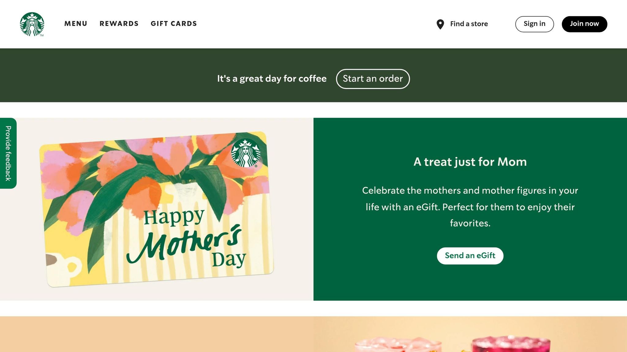
Starbucks: Evolving Beyond ‘Coffee’
Challenges of a Coffee-Centric Identity
By the late 2000s, Starbucks found itself facing a branding dilemma: its logo tied the company closely to coffee, limiting its ability to branch out into other offerings. Despite already venturing into tea and food, the brand’s identity remained firmly rooted in coffee, creating a barrier to broader growth.
As Starbucks expanded globally, the essence of its neighbourhood coffeehouse charm began to fade. Founder Howard Schultz described this shift as a "watering down" of the brand, where cosy, personal interactions gave way to a more transactional feel. By 2024, Starbucks realised that operational hurdles – such as overly complex menus and inconsistent product quality – were impacting the in-store experience. This prompted a shift in focus: Starbucks aimed to transform into a "third place" – a welcoming space between home and work where the overall experience mattered just as much as the products.
Visual and Brand Changes
In 2011, Starbucks made a bold move: it removed the words "Starbucks" and "Coffee" from its logo, leaving only the green Siren symbol. This wasn’t just a design update; it marked a strategic shift toward diversifying the brand while reinforcing its role as a "third place".
"Even though we have been and always will be a coffee company and retailer, it’s possible that we’ll have other products with our name on it, but no coffee in it." – Howard Schultz, Founder, Starbucks
Starbucks continued to evolve its brand identity. In spring 2022, the company revamped its ready-to-drink range across 21 markets in the EMEA region, including the UAE and Saudi Arabia. Collaborating with Landor & Fitch, the redesign introduced green Frappuccino bottle lids and vibrant, texture-inspired packaging. This update was paired with a TV campaign that scored 90% in Kantar LINK tests, with 80% of YouTube viewers watching the full ad within its first month.
"We have taken bold ownership of the Starbucks green and showcased our Siren against the brilliant new coloured textures to forge a greater emotional connection with our customers." – Charlotta Oldham, Marketing Director, EMEA at Starbucks
Global Market Expansion
With its refreshed identity in place, Starbucks pushed forward with global campaigns that aligned with its new vision. By June 2019, the company operated over 30,000 stores in 80 countries. In the UAE, where Starbucks is managed by the Alshaya Group, the brand played a prominent role in regional growth.
In April 2026, Starbucks launched a striking hoarding campaign along a busy Dubai highway. Managed by Alshaya Group and Media 247, the campaign featured images of hands holding Starbucks cups, each with names handwritten in different languages. This creative approach brought the brand’s in-store personalisation to life on a grand scale, highlighting its commitment to building a strong brand identity in the UAE by connecting with customers in meaningful ways.
The strategy of "uplifting the everyday" resonated deeply in the UAE. Starbucks positioned itself not just as a place to grab a drink but as a part of the small, meaningful moments in people’s days. From handwritten names on cups to store designs that encouraged personal interactions, Starbucks built loyalty in a market where both quality and experience are highly valued.
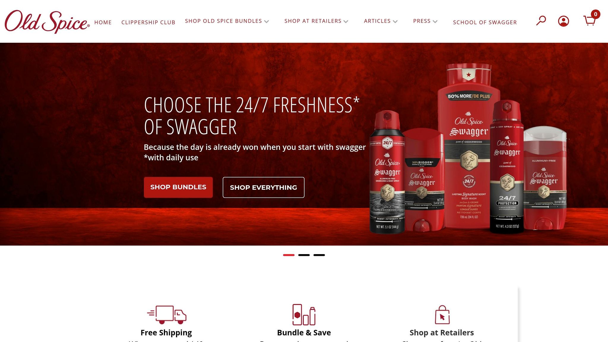
Old Spice: Revitalizing a Dated Brand
Pre-Rebrand Challenges
By the early 2000s, Old Spice had a big problem: younger men saw it as a relic from the past – something their grandfathers used. Despite holding a 20% share of the U.S. men’s deodorant and body wash market, the brand was struggling to stay relevant. It relied heavily on its legacy but wasn’t doing much to connect with younger consumers.
Things got worse in 2002 when Axe Body Spray entered the U.S. market, directly targeting men under 25. Axe’s bold approach put Old Spice under serious pressure, threatening its market position. Procter & Gamble even considered selling off Old Spice – along with Noxzema and Comet – if it couldn’t find a way to grow quickly. Adding to the challenge, advertising efforts before 2006 were minimal, mainly focusing on keeping their older customer base. The brand desperately needed a makeover to avoid fading into obscurity.
"Originally a success with young men, this brand eventually was perceived as a product more relevant for someone older than them – even their father or (gasp!) their grandfather." – Jay Nachlis, Coleman Insights
Rebranding Campaigns
Faced with these challenges, Old Spice decided to take a bold new direction. In February 2010, Procter & Gamble launched the now-iconic "The Man Your Man Could Smell Like" campaign. Created by Wieden+Kennedy and starring Isaiah Mustafa, the campaign flipped the script on traditional advertising. Instead of directly targeting men, it spoke to women, recognising that 60% of men’s body wash purchases were made by their female partners.
The ad’s witty, fast-paced style and Mustafa’s charm made it stand out from the usual macho tone of men’s products. But it wasn’t just about TV commercials. Mustafa also recorded 186 personalised video messages in just 2.5 days, engaging directly with fans on social media. This interactive approach turned the campaign into a cultural phenomenon. Within 24 hours, the videos racked up 6 million views, and by 2022, they had surpassed 60 million views. The campaign’s success earned it the Grand Prix at the Cannes Lions International Advertising Festival and a Primetime Emmy Award for Outstanding Commercial.
Sales and Demographic Shifts
The results were immediate and impressive. Within three months, body wash sales shot up by 60%, and by July 2010, they had doubled compared to the previous year. Old Spice not only regained market share from competitors like Axe but also redefined itself as a trendy brand for Millennials and Gen Z. What was once seen as “grandpa’s cologne” became a must-have for a younger, style-conscious audience.
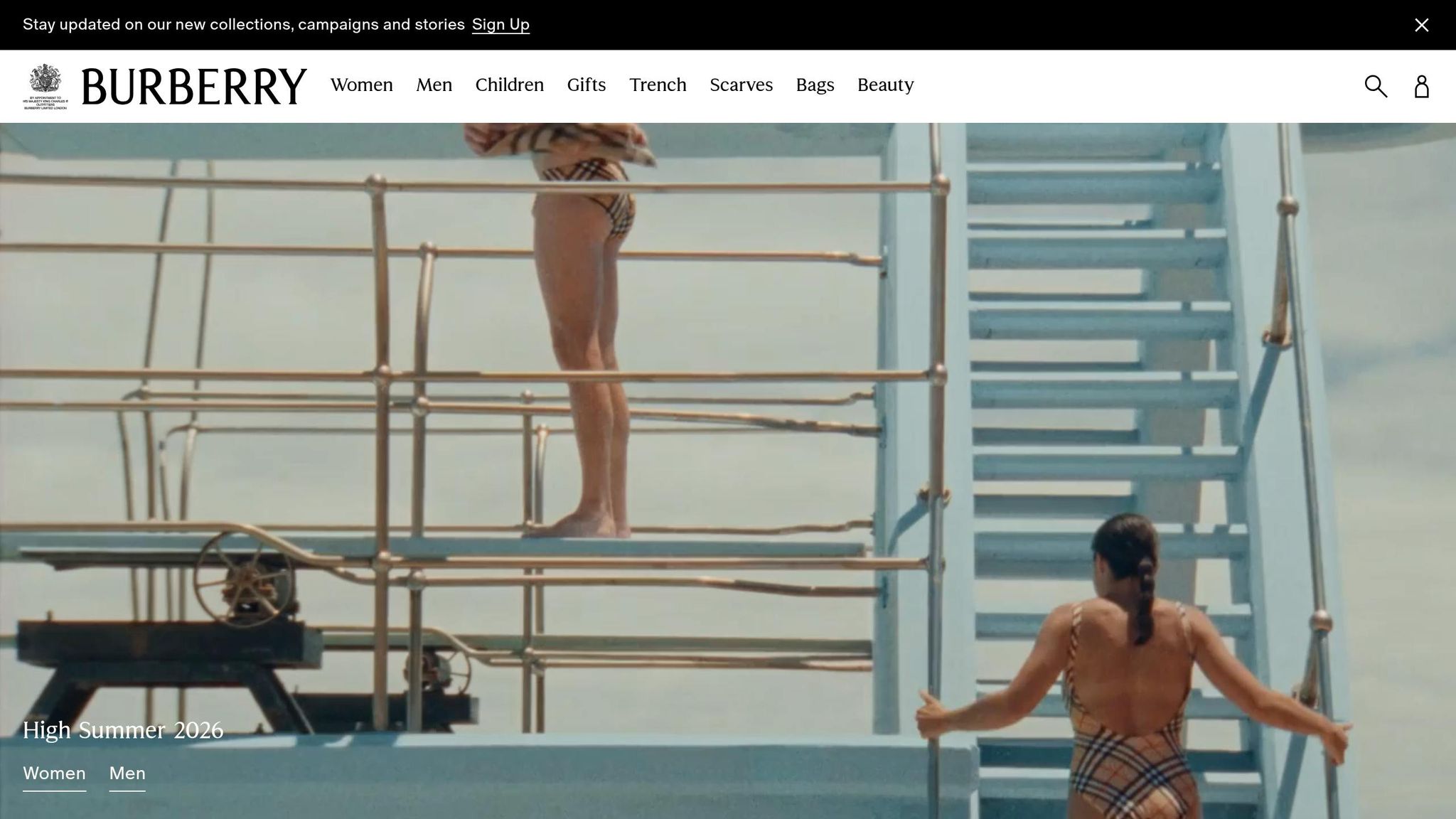
Burberry: Restoring Luxury Status
Challenges with Overexposure
By the early 2000s, Burberry found itself in a tough spot. The iconic check pattern, once a hallmark of British luxury, had become overexposed and widely counterfeited. This not only diluted its exclusivity but also tarnished its reputation. Back in 1997, the brand was even referred to as a "neglected backwater" within the Great Universal Stores empire. Counterfeit products and inconsistent licensing practices pushed Burberry into discount and grey-market channels, significantly undermining its luxury appeal.
The grey market in Asia exacerbated the problem. Products were sold at reduced prices or re-imported to Europe at steep discounts, eating into full-price sales. Former CEO Rose Marie Bravo captured the gravity of the situation:
"It [grey-market trading] had begun to damage the brand and, if continued, could have been lethal."
The situation reached a symbolic low point during a 2006 board meeting, where none of the 60 members wore a Burberry trench coat – even though they had access to employee discounts.
Key Rebranding Tactics
To reclaim its status, Burberry made bold moves. The brand scaled back its use of the check pattern, reserving it for premium collections, which helped restore its exclusivity. In November 2024, CEO Joshua Schulman unveiled the "Burberry Forward" strategy, a plan rooted in the brand’s 170-year history. The focus shifted to timeless pieces like the Gabardine trench coat, steering away from fleeting high-fashion trends.
Creative Director Daniel Lee introduced a fresh yet heritage-driven aesthetic. He replaced the "TB" logo from the Tisci era with the archival Equestrian Knight Design and a classic serif wordmark, reinforcing the brand’s return to traditional luxury. Burberry also embraced digital innovation, launching the "Art of the Trench" campaign, which encouraged user-generated content and boosted e-commerce sales by over 50%. As a trailblazer in digital engagement, Burberry became the first major luxury brand to livestream runway shows. Campaigns like "It’s Always Burberry Weather" used British humour and storytelling to connect emotionally with audiences. These efforts laid the groundwork for a strong market recovery and renewed trust among consumers.
Results of the Transformation
The impact of these changes was immediate and measurable. Following the launch of "Burberry Forward" in November 2024, the company’s share prices jumped 22.4%, and retail sales saw a smaller decline of 5% in H2 FY2025, compared to the previous 20%. Inventory levels were reduced by 7% year-on-year as of March 2025, preserving the brand’s exclusivity and supporting its margins.
Burberry also succeeded in winning over younger consumers, with Gen Z and Millennials making up about 75% of luxury purchases in 2023–2024. Brand awareness soared to 85% in Japan, though it remained lower in key growth areas like China (67%) and the Middle East (65%). On the digital front, the brand maintained its leadership with exceptional online customer service. CEO Joshua Schulman expressed his confidence in Burberry’s future:
"While we are operating against a difficult macroeconomic backdrop and are still in the early stages of our turnaround, I am more optimistic than ever that Burberry’s best days are ahead."
Airbnb: Building Trust and Belonging
Rapid Growth Challenges
By the early 2010s, Airbnb was expanding quickly, but it faced a key issue. The platform was still seen as just "a place to stay." Marketing efforts focused on location and price, and the room listings often lacked the warmth and charm of a real home. This made it harder for users to feel a sense of trust or connection. For travellers, staying in a stranger’s property could feel awkward and impersonal, emphasising the divide between them and the local community.
Introduction of the "Bélo" Logo
In July 2014, Airbnb teamed up with London-based agency DesignStudio for a complete rebrand. CEO Brian Chesky played a hands-on role, even relocating the design team to Airbnb’s San Francisco headquarters to overhaul the platform’s digital experience. The centrepiece of this transformation was the "Bélo" logo – a simple, versatile icon symbolising people, places, love, and Airbnb itself. Its design made it easy to replicate and customise, breaking through language barriers. A dedicated microsite encouraged users to personalise their own versions of the Bélo logo.
This rebrand introduced Airbnb’s new mission: "Belong Anywhere." The focus shifted from simply booking accommodations to fostering real human connections. A fresh coral-red colour palette replaced the old blues and greens, bringing a sense of warmth and energy. CEO Brian Chesky summed up the impact of the rebrand:
"When I look at this brand, I suddenly realise everything I’ve been trying to say. Now we have a way to express it."
- Brian Chesky, CEO & Co-Founder, Airbnb
This updated identity became a cornerstone for strengthening user trust and engagement, serving as a blueprint for consistency across the platform.
Building User Loyalty
Airbnb’s rebrand wasn’t just about a new look – it transformed the company’s relationship with its users. The "Belong Anywhere" mission became a guiding force across the business, influencing everything from HR policies and office design to partnerships and community-focused projects. The results were clear: by September 2016, Airbnb had surpassed 100 million guest arrivals, demonstrating impressive growth. Within just four years of the rebrand, Airbnb’s valuation climbed by US$29 billion, outpacing its closest competitor.
When Airbnb went public in December 2020, its share price more than doubled from its US$68 IPO price, pushing its market capitalisation to approximately US$86.5 billion. Today, Airbnb’s impact is undeniable, with over 5 million hosts and 2 billion guests worldwide as of 2025. The platform generates 70–80% of total booking revenue in most markets.
This rebrand didn’t just redefine Airbnb’s visual identity – it fundamentally reshaped how users engaged with the platform and each other, creating a stronger sense of trust and loyalty.
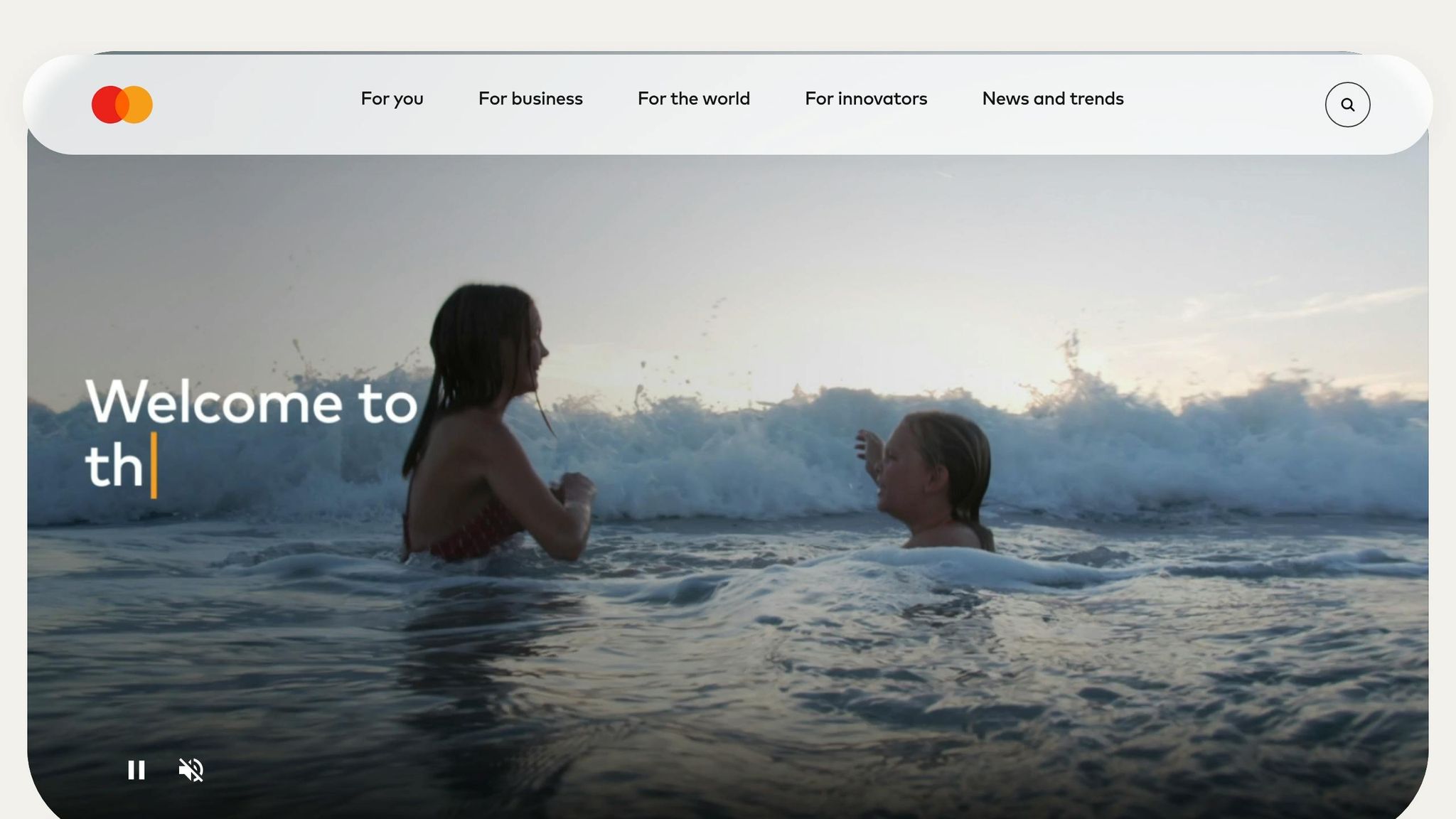
Mastercard: Simplifying for the Digital Age
Meeting Digital Payment Needs
As the world moved further into the digital realm, Mastercard found itself at a crossroads by 2016. The company’s logo, with its detailed design and camel case "MasterCard" typography, struggled to display effectively on smaller digital screens like those of smartphones, smartwatches, and app icons. With more than 2.3 billion cards in use globally and the rapid rise of digital payments, it became clear that Mastercard needed to transition from being seen as just a credit card company to a forward-thinking technology brand. The growing popularity of digital wallets, contactless payments, and wearable devices signalled a shift away from reliance on physical cards, making it essential to downplay the word "Card" in its identity.
Streamlined Visual Identity
In line with its strategy to embrace digital transformation, Mastercard overhauled its visual identity in July 2016. The redesign, spearheaded by Michael Bierut and Luke Hayman from design firm Pentagram, introduced a cleaner and more modern look. The intricate design was replaced with a simple overlapping colour pattern, and the wordmark was moved outside the red and yellow circles. Additionally, the camel case "MasterCard" was updated to lowercase "mastercard." Raja Rajamannar, the Chief Marketing & Communications Officer, explained:
"We purposely went with all lower case typography to de-emphasise the word ‘Card.’ A subtle but significant change as it represents the different digital and mobile ways consumers can now make payments beyond the physical card in their wallet."
The redesign was a success. Internal testing showed that more than 80% of participants could instantly recognise the iconic red and yellow circles even without the company name, proving that the minimalist design was effective across both digital and physical platforms.
Versatility and Global Recognition
The rebranding effort brought tangible benefits. By December 2023, Mastercard’s "Digital First" programme had driven a 10% increase in contactless transactions, an 8% rise in tokenised transactions, and a 7% boost in transactions per active account. At the same time, fraud costs dropped by 8.6 basis points. The updated, simplified design worked flawlessly across various formats, from large billboards to tiny digital interfaces. By March 2026, Mastercard had processed over US$9 trillion in annual payments and had 3.3 billion cards in circulation globally, cementing its position as a leader in the digital-first payments landscape. This streamlined identity reflects a broader industry shift, as brands adapt to meet the demands of the digital age.
Key Takeaways for Market Adaptation
Common Strategies for Success
Looking at the seven rebranding examples, a few recurring strategies stand out. One of the most impactful moves was modernising and simplifying visuals. Clean, minimal designs not only look great but also work better in digital spaces, which is crucial for driving business growth. Another effective approach was simplifying brand names. By aligning their names with their main revenue streams, these brands made their identity clearer and more relevant. The key here is that successful rebrands focus on aligning the brand identity with what drives the business, rather than just making cosmetic changes. These strategies laid the groundwork for achieving measurable results and guided the next steps for rebranding efforts.
Measuring Rebranding Success
For rebranding to be truly effective, it needs to deliver measurable results. The best examples tied their visual updates directly to business performance metrics. Take Dunkin’, for example: its rebrand shifted focus to beverages, reflecting its actual sales composition, and this alignment was a clear success. At the same time, maintaining brand equity was vital – brands that modernised their look while keeping iconic elements managed to keep their loyal customers on board. For large organisations, rebranding also brought benefits like improved investor transparency and stronger financial discipline. Operational changes, such as adding new product lines or services, further showed that these rebrands were more than just a facelift – they supported real business growth. Regional brands have also adopted these principles to refresh their identities successfully.
Insights for UAE Brands
UAE brands can draw inspiration from these global rebranding successes while tailoring strategies to fit the local market. For instance, companies like ADNOC and ADCOOP have shown how to blend heritage with modernity. In 2024, ADCOOP rebranded by unifying seven retail brands under a single identity inspired by traditional Emirati doors and the Arabic "Hamza." As Sawalha explained:
"The brand mark was developed based on an abstract form of the Arabic ‘Hamza’ and the letter ‘a,’ creating a logo that bridges the past and the future, the East and West."
ADNOC also underwent a significant transformation between 2015 and 2017 under the leadership of CEO Sultan Al Jaber. Working with MBLM, the company restructured its brand architecture while preserving key elements of its core identity. For UAE brands, bilingual consistency between English and Arabic is particularly important for ensuring strong regional recognition. Additionally, investing in in-house creative teams can make a big difference. For example, Careem’s 20-person creative studio played a huge role in executing its May 2023 rebrand quickly and in line with its business goals.
FAQs
When should a business rebrand vs refresh?
When a business finds its identity no longer matches market trends, customer expectations, or its strategic direction, it might be time for a full rebrand. This involves rethinking the brand from the ground up to ensure it aligns with the new goals or audience.
On the other hand, a brand refresh is better suited when the core identity is still relevant but could use some updates. This might include tweaking visuals or refining the messaging to maintain a modern and consistent presence.
Choosing between the two comes down to how much change is necessary to adapt to shifting market needs.
How do you measure rebranding success in sales and trust?
Rebranding success in sales can be gauged by monitoring revenue changes and sales growth over a period of 90 to 180 days. Trust, on the other hand, is assessed by examining shifts in brand awareness, customer perception, and specific metrics like brand recognition and reliability. These factors are shaped by maintaining consistent branding efforts over time.
How can UAE brands keep Arabic-English branding consistent?
UAE brands can maintain consistent Arabic-English branding by paying close attention to the cultural and linguistic subtleties of both languages. It’s important to align visual elements, such as calligraphy styles, and ensure the tone of voice complements both languages seamlessly. Creating detailed brand guidelines that thoughtfully combine Arabic and English elements helps preserve a genuine identity. Additionally, working with local experts ensures the brand stays culturally aware and connects effectively with the UAE’s diverse audience.
Related Blog Posts

BRAND HUSL
We’re a collective of brand strategists, designers, and unapologetic truth-tellers who’ve spent over two decades turning chaos into clarity for businesses across the globe. From global names to fearless startups, we’ve built brands that stick, scale, and sell—without the fluff. Everything we create is rooted in strategy, storytelling, and ROI, because good branding isn’t just pretty—it’s powerful.