Typography hierarchy isn’t just about making text look good – it’s about guiding your audience’s attention, building trust, and shaping how they perceive your brand. By using size, weight, colour, and spacing effectively, you can make your content easier to read and more engaging, whether it’s on a website, a product package, or an outdoor ad.
Here’s why it’s important:
- First Impressions: People judge your brand in milliseconds. Clear typography grabs attention and conveys professionalism.
- Readability: With endless information online, a structured hierarchy makes your content easier to scan and understand.
- Consistency: Uniform typography across platforms reinforces brand recognition and trust.
- Cultural Relevance: In the UAE, seamless bilingual typography (Arabic and English) is key to connecting with diverse audiences.
Typography hierarchy isn’t just design – it’s a tool for better communication and stronger branding.
How Typography Hierarchy Affects Brand Perception
Typography Hierarchy Impact on Brand Perception and User Behavior Statistics
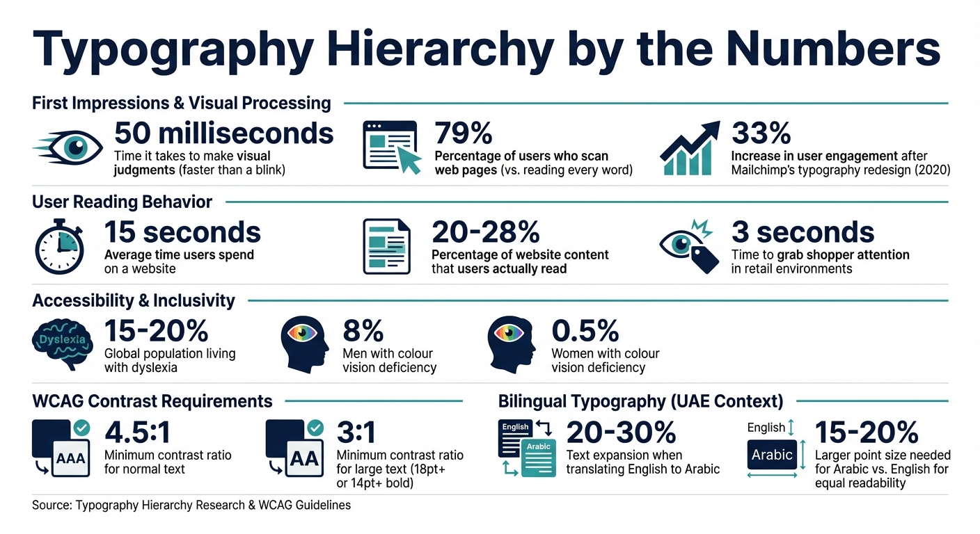
Typography hierarchy plays a crucial role in shaping how people perceive a brand – often before they even read a single word. Research shows that visual judgments are made in just 50 milliseconds, faster than the blink of an eye. The way text is structured visually tells your audience whether your brand feels trustworthy, modern, or professional. By clearly organising information, hierarchy reduces mental effort, allowing viewers to engage with your brand more easily and meaningfully.
Visual Processing and First Impressions
When people first encounter your brand, they don’t read – they scan. Studies reveal that 79% of users scan web pages, while only a small percentage read every word. Key elements like H1 headers act as visual anchors, grabbing attention instantly and setting the tone for your brand’s personality. This subconscious process shapes trust and emotional connection before users even begin to evaluate your brand logically.
Take Mailchimp as an example. In 2020, the company transitioned from the Cooper BT typeface to a custom serif called "Means." This change enhanced both its digital and print assets, aligning with its playful yet professional identity. The result? A 33% increase in user engagement across campaigns. This demonstrates how a well-thought-out typography hierarchy can drive not only perception but also measurable consumer behaviour.
"Typography isn’t about decoration. It’s the voice of your brand when everything else is silent." – Alabi Mercy, Writer, Neue World
Building Brand Recognition Through Consistency
After the initial impression, maintaining a consistent typography system is key to reinforcing your brand’s credibility. A unified approach across all platforms helps build trust and strengthens recognition, while inconsistencies can erode confidence. With users spending an average of 15 seconds on a website and reading only 20–28% of its content, a clear hierarchy ensures that the most important messages – headings and highlighted phrases – stand out and guide decisions.
"Typography hierarchy strongly influences those early judgments because it defines clarity, order, and perceived quality before users read anything in depth." – Raw.Studio
Consistency isn’t just about aesthetics; it’s about creating a predictable structure that feels familiar. When your typography remains uniform across touchpoints – whether it’s your website, product packaging, or outdoor ads – it builds a sense of reliability. This consistency reassures consumers that your brand pays attention to detail, fostering confidence and loyalty over time.
Core Principles for Building Typography Hierarchy
A well-structured typography hierarchy is crucial for effective visual communication. By carefully combining size, weight, colour, contrast, and spacing, you can transform plain text into a clear system that communicates your brand’s message effectively.
Using Font Size and Weight to Guide Attention
Font size is your go-to tool for establishing hierarchy. Larger text naturally grabs attention first, making it an obvious marker of importance. But size alone doesn’t do the job – font weight (the thickness of the letters) adds another layer of emphasis. It allows you to highlight key points or calls to action without always needing to adjust size.
"Typography hierarchy answers the question: ‘What should the user notice first, second, and third?’" – Eseosa Francis Aduwa
The trick is to create clear contrast between different text levels. If your headings are just slightly bigger than the body text, it muddies the hierarchy, leaving readers unsure of what to focus on. As a general rule, main headers should be about 250% larger than body text, secondary headers 175%, navigation elements 165%, and menus 140%.
Designers often rely on mathematical ratios to maintain visual harmony across text elements. Popular scales include 1.25 (major third), 1.333 (perfect fourth), and 1.5 (perfect fifth). These ratios ensure consistency and balance. For instance, Jeffrey Zeldman’s website prioritises readability with a 24-pixel font size for body text, while Vogue.com opts for 19 pixels to align with its sophisticated image.
When it comes to font weight, variable fonts offer flexibility, ranging from 100 (thin) to 900 (black). Use bold text sparingly – overdoing it can overwhelm the design and dilute its impact. Begin by setting a base size for your body text (typically 14–16 pixels for web content), then scale up for headings and subheadings using your chosen ratio.
Once you’ve nailed size and weight, it’s time to enhance readability with colour and spacing.
Applying Colour, Contrast, and Spacing for Readability
Colour and contrast are powerful tools for drawing attention and establishing importance. Darker shades usually indicate higher priority, while lighter tones help less critical elements fade into the background. However, these choices must be paired with strong contrast ratios to ensure accessibility for all users, including those with visual impairments.
The Web Content Accessibility Guidelines (WCAG 2.1) recommend a minimum contrast ratio of 4.5:1 for normal text and 3:1 for large text (defined as 18 points or larger, or 14 points or larger if bold). This isn’t just about meeting standards – it’s about making sure your message is clear to everyone.
Spacing also plays a key role in readability. For headings, a line-height of 1.1–1.3 works well, while body text benefits from 1.5–1.8 to prevent a cluttered appearance. Tightly packed text blocks can overwhelm readers, while overly spaced lines can disrupt comprehension.
"A heading should not be slightly bigger than body text. It should be clearly different." – Fasasi Malikat
Proximity – the spacing between elements – helps readers understand relationships. Group related text closer together while keeping unrelated sections further apart. For example, position a heading closer to its corresponding paragraph than to the content above it. This simple adjustment reduces mental effort and clarifies content structure.
Consistency in colour use also reinforces hierarchy. Assign a specific colour to all H2 headings, for instance, but keep your palette limited to avoid visual overload. Colour can also highlight interactive elements like links or buttons, instantly signalling their functionality.
Once colour and spacing are in place, text alignment becomes the final touch for guiding navigation.
Text Positioning and Alignment for Easy Navigation
Text alignment and positioning create a visual roadmap for readers, making it easier to navigate content. Consistency in alignment promotes order and improves the flow of information.
Left-alignment is the gold standard for long-form content in digital spaces. It keeps the starting point of each line consistent, improving legibility and maintaining a steady rhythm for the reader.
"Alignment plays a silent but powerful role in hierarchy. Consistent alignment improves scanability, creates visual order, and makes hierarchy predictable." – Fasasi Malikat
Centred text works well for titles or short, impactful statements, but it’s less effective for body text, as it disrupts readability. Save unconventional positioning – like placing text outside standard margins – for special elements such as pull quotes or statistics. This approach draws attention to key points without overwhelming the overall design.
Generous white space and adequate margins prevent your content from feeling cramped. Paragraph margins help visually separate ideas, giving readers a clearer sense of structure. This "breathing room" not only enhances aesthetics but also speeds up navigation, allowing users to find what they need faster and with less effort.
Applying Typography Hierarchy Across Different Platforms
Your typography hierarchy needs to work seamlessly across all platforms – from packaging in Dubai supermarkets to mobile apps – while keeping your brand identity intact. By adapting the core principles of size, weight, colour, and spacing, you can create effective designs for both physical and digital touchpoints. Let’s explore how these principles come to life in different contexts.
Typography in Retail and Packaging Design
In retail, you’ve got just three seconds to grab a shopper’s attention. Typography hierarchy is your secret weapon for making that instant connection. Studies show that consumers tend to scan packages starting from the centre and moving outward. This insight shapes how you structure your text.
A four-tier system works well for packaging:
- Primary elements: The brand or product name, using the largest and boldest text.
- Secondary details: Benefits or product variants, highlighted with medium emphasis.
- Tertiary information: Nutritional claims or similar details, in smaller text.
- Quaternary content: Ingredients or fine print, in the smallest size.
"In the lightning-fast decision environment of retail, strategic typography and visual hierarchy aren’t merely design considerations – they’re business imperatives." – Eye Candy Design
For the UAE market, it’s essential to incorporate both Arabic and English typefaces. Pairing fonts like Noto Kufi Arabic with Roboto ensures a cohesive brand voice. Coca-Cola offers a great example by translating its name into Arabic calligraphy while maintaining its iconic look, even when switching orientation from left-to-right to right-to-left.
Your packaging should also perform well at three key viewing distances:
- Far view (about 1.8 metres): Focus on brand recognition.
- Mid-range (around 0.9 metres): Highlight product differentiation.
- Close view (arm’s length): Provide detailed information.
A quick tip: use the squint test. Blur your vision slightly to see which design elements stand out most. This helps ensure that your key messages dominate and build shopper trust.
Typography for Digital Interfaces and Multiple Channels
Digital platforms bring a different challenge: text must adapt to various screen sizes and orientations while staying legible. Arabic text often expands by 20–30% compared to English, so flexible containers are crucial to avoid layout issues. The UAE Design System suggests specific font pairings: Roboto for English body text with Inter for headings, and Noto Kufi Arabic for Arabic body content with Alexandria for headings.
Maintaining visual balance is key. Arabic script typically requires point sizes 15–20% larger than English for equal readability. Align content appropriately – left-aligned for English and right-aligned for Arabic – to create a natural reading experience in both languages.
For responsive scaling, use the one-step decrease rule: for example, an H1 on desktop should scale down to an H2 or H3 on mobile. Always keep your base font size at 16 pixels (1 rem) for accessibility. To further enhance readability, set line heights to 1.5 times the font size, which benefits users with low vision or cognitive challenges.
Lastly, define fallback fonts in your CSS (e.g., -apple-system, system-ui) to safeguard your layout when custom fonts fail. This ensures your design remains functional and visually consistent across all devices and platforms.
sbb-itb-6cae99a
Common Typography Mistakes and How to Fix Them
Even well-established brands can slip up when it comes to typography, leading to a loss of trust and a less professional image. The good news? Most typography errors are easy to spot and fix once you know what to look for. Following clear typography principles helps ensure your brand’s visual hierarchy communicates effectively and builds trust.
Inconsistent Typography Across Platforms
Imagine your website uses one font, your Instagram posts another, and your product packaging yet another. This inconsistency can confuse your audience and dilute brand recognition.
"Inconsistent fonts scream disorganisation. Just like clashing colours or mixed messaging, inconsistent typography weakens reliability." – Brand Guidelines Lab
The solution? Start with a typography audit. Review all your brand touchpoints – your website, emails, social media, packaging, and even signage. Look for mismatched fonts or styles. Then, narrow your choices down to two or three complementary typefaces. Typically, you’ll want one for headings and one for body text. For bilingual brands in the UAE, consider font pairings like Roboto and Noto Kufi Arabic, which work well for both English and Arabic content.
Document these choices in your brand guidelines. Include a "do’s and don’ts" section, outlining rules like avoiding stretched fonts, not centring long paragraphs, and steering clear of decorative fonts for critical information. Also, tailor your typography rules to specific platforms. For example, what’s effective on a large billboard won’t necessarily work on a mobile screen. With clear, shared standards, your team can maintain consistency effortlessly.
Now, let’s look at another common pitfall: overusing emphasis tools.
Overusing Bold, Italics, and Colour
When everything on a page is bold, italicised, or brightly coloured, it’s hard to focus on any one element. This "visual noise" can make your brand appear cluttered and unpolished.
"If everything is bold, nothing is bold. If everything is large, nothing is large. The system works because each level has a clear, specific treatment." – FontFYI
The key here is restraint. Before you highlight something with bold text or colour, ask yourself: does this need to stand out? Use bold sparingly for essential terms or warnings. Italics should be reserved for emphasis or foreign words. Stick to just two or three colours across your design, and apply your brand’s accent colour only to high-priority elements, like call-to-action buttons or active links.
A helpful tip is the "grayscale foundation" approach. First, design your hierarchy using only black, grey, and white. Use the darkest shade for headings, medium grey for body text, and lighter grey for secondary details like captions or timestamps. This method forces you to create structure through size, weight, and spacing – not colour. Once your hierarchy is solid, you can add colour sparingly to make key elements pop.
Another trick is to explore your font’s weight options. Instead of defaulting to bold, try weights like "Medium" (500) or "Semibold" (600). These subtler variations can separate elements without overwhelming the design. For example, in a dashboard layout, you might use a 600 weight for labels and a 400 weight for values. This approach guides the reader’s eye without creating unnecessary clutter.
Making Typography Hierarchy Accessible to All Users
Typography that prioritises accessibility isn’t just about ticking boxes – it’s about ensuring your brand communicates effectively with every individual, regardless of their abilities. Designing with accessibility in mind benefits everyone, not just users with visual or cognitive impairments. For instance, it helps those reading on mobile devices under bright sunlight or older audiences who may struggle with smaller text. This idea, often referred to as the "curb-cut effect", highlights how features designed for specific needs ultimately enhance usability for all. By embracing this approach, you also align with formal accessibility standards, which we’ll explore next.
Following WCAG Standards in Typography Design
The Web Content Accessibility Guidelines (WCAG) provide a framework for accessible typography. For instance, WCAG 1.4.12 specifies that designs should adapt seamlessly when users adjust text spacing. To meet this, your layout should support:
- A line height of at least 1.5x the font size
- Paragraph spacing of 2x the font size
- Letter spacing of 0.12x the font size
- Word spacing of 0.16x the font size
These adjustments help reduce "visual crowding", which often makes reading challenging for individuals with dyslexia or low vision.
Another key guideline is the use of relative units like rem or em instead of fixed pixel values. This ensures users can resize text up to 200% via browser settings without breaking the layout. Additionally, your content must reflow within a 320px-wide viewport (equivalent to 400% zoom) without triggering horizontal scrolling. For example, setting body text to 1rem (16px) instead of 16px honours user preferences while maintaining design integrity.
Designing Typography for Diverse Audiences
When working in bilingual or multilingual environments – like the UAE – accessible typography becomes even more nuanced. For example, the UAE Design System recommends pairing Roboto for English content with Noto Kufi Arabic for Arabic. This ensures consistent readability across both languages. Arabic content should follow right-alignment and its natural directional flow (dir="rtl"), while English text should remain left-aligned. Avoid justified text at all costs, as it creates "rivers of whitespace" that disrupt readability, especially for users with dyslexia.
Font selection is equally important. Choose typefaces that clearly differentiate similar-looking characters, such as "1, l, I" (one, lowercase L, uppercase I) and "O, 0" (capital O, zero). This is particularly helpful for users with low vision or cognitive challenges who depend on recognising shapes. Additionally, aim for a line length of 60–100 characters to optimise readability.
Globally, around 15–20% of people live with some form of dyslexia, while approximately 8% of men and 0.5% of women experience colour vision deficiency. By considering these factors, you’re not creating a separate "accessible version" of your content. Instead, you’re crafting a unified, inclusive experience that works for everyone.
"Typography is the foundation of accessible content. Even when interfaces are technically functional, poor font choices, weak colour contrast, or crowded line spacing can make text unreadable for many users." – Accesify Team
Typography Hierarchy: A Strategic Asset
Typography hierarchy isn’t just about making things look good – it’s a strategic tool that influences how people see your brand, interact with your content, and decide to engage with your business. Humans process visuals in a split second, so your typography needs to guide attention to the most important elements while making information easy to digest.
A well-planned typographic system does more than organise content; it strengthens your brand identity across all platforms. Over time, consistent typography can become as recognisable as your logo, creating a sense of familiarity across everything from packaging and signage to websites and social media. This consistency doesn’t just look good – it can reduce bounce rates, improve SEO rankings, and turn your content into a powerful driver for conversions.
"Typography is the unsung hero of brand perception. The fonts you choose are not merely decorative; they carry inherent personalities and evoke specific emotions." – HelloWorld Label
But great typography is about more than just picking the right font. It requires a thoughtful balance between design and functionality. This is where Brand Husl can help. With their expertise, your typography will not only look great but also perform seamlessly across every platform – whether it’s a mobile screen or a massive billboard – all while meeting accessibility and cultural expectations in the UAE.
Typography hierarchy takes information and turns it into action. By investing in a well-structured system, you’re not just enhancing your brand’s visual identity – you’re driving real business results.
FAQs
How do I choose a type scale for my brand?
To determine a type scale, begin with a base font size – commonly 16–18px for digital content or 10–12pt for print materials. Then, use a ratio (like 1.25) to calculate sizes for headings, subheadings, and body text. For example, if your body text is set at 16px, your headings might be 20px or 25px. Choose a scale that aligns with your brand’s style while ensuring readability, helping users navigate your content effortlessly.
What’s the best way to balance Arabic and English typography?
To create harmony between Arabic and English typography, it’s important to respect the distinct characteristics of both scripts. Choose typefaces that align in style and weight to maintain visual balance. For layouts, options like side-by-side or stacked arrangements can work effectively, depending on the content. Always prioritise right-to-left (RTL) orientation for Arabic text to maintain proper flow and readability. Additionally, ensure accurate font substitution to avoid rendering issues. Fonts such as Noto Kufi Arabic or Alexandria are excellent choices, as they provide both clarity and sophistication while honouring local preferences in the UAE.
How can I check if my typography is WCAG-accessible?
Typography plays a key role in accessibility. To align with WCAG standards, focus on the following:
- Font size and contrast ratios: Ensure text is large enough to read comfortably and meets a minimum contrast ratio of 4.5:1 for normal text. This improves visibility for users with visual impairments.
- Readability at different zoom levels: Test your content to ensure it remains clear and functional when zoomed in. This is crucial for users who rely on magnification tools.
- Assistive technologies: Use automated tools or test manually with screen readers to verify that your typography works seamlessly with these technologies.
- Headings and labels: Properly structure headings and labels to guide users through the content logically and efficiently.
- Text over images: Make sure any text displayed over images is easy to read and does not blend into the background.
By addressing these elements, you can create a more inclusive and user-friendly experience for everyone.
Related Blog Posts

BRAND HUSL
We’re a collective of brand strategists, designers, and unapologetic truth-tellers who’ve spent over two decades turning chaos into clarity for businesses across the globe. From global names to fearless startups, we’ve built brands that stick, scale, and sell—without the fluff. Everything we create is rooted in strategy, storytelling, and ROI, because good branding isn’t just pretty—it’s powerful.