Your brand’s colors speak louder than words – and faster. People form opinions about your brand in milliseconds, based on color alone. This makes choosing the right palette a key step in building a strong identity. The concept of color harmony ensures that your colors work together seamlessly, creating balance, evoking emotions, and guiding decisions.
Here’s what you need to know:
- Color harmony creates balance and avoids visual discomfort.
- 90% of snap judgments about brands are influenced by color.
- Consistent color use boosts brand recognition by up to 80% and can increase revenue by 23%.
- In the UAE, colors like green, gold, and white carry deep cultural significance.
Whether you’re designing a website, product packaging, or marketing materials, understanding how to combine colors effectively can make your brand stand out. Explore the science behind balance, contrast, and cultural relevance to create a palette that not only looks great but also resonates with your audience.
Core Principles of Colour Harmony in Branding
Creating colour harmony involves following key principles that give your brand a polished and professional appearance. These principles help establish strong brand recognition and ensure your identity resonates consistently, whether on a website, business card, or billboard. Below are the essential guidelines that can help you design a colour palette that is both visually appealing and functional.
Balance and Contrast
Balance ensures that your primary and supporting colours work together without one overshadowing the other. Think of it as a conversation where every colour has its role. At the same time, contrast is essential for usability – especially when it comes to readability. Text needs to stand out against its background, and different content elements should have clear visual separation.
“Colour harmony in design refers to the balanced and aesthetically pleasing interaction of colours.” – Interaction Design Foundation
One effective way to test contrast is by viewing your palette in greyscale. This helps you assess whether your design maintains enough contrast for accessibility and hierarchy. Remember, many users experience colour vision deficiencies. For example, blue and yellow combinations are more accessible for colour-blind users compared to red and green pairings. By following these guidelines, you can lay a strong foundation for applying the 60-30-10 rule.
The 60-30-10 Rule
This rule offers a simple framework for distributing colours in your branding. Here’s how it works:
- 60% Dominant Colour: This is typically a neutral shade like white, grey, or beige, used for backgrounds and large surfaces.
- 30% Secondary Colour: This adds structure and contrast, often applied to navigation bars, headers, or other structural elements.
- 10% Accent Colour: Reserved for key highlights like call-to-action buttons, links, or icons.
| Percentage | Role | Purpose | Typical Application |
|---|---|---|---|
| 60% | Dominant | Foundation & Mood | Backgrounds, white space, large surfaces |
| 30% | Secondary | Structure & Contrast | Nav bars, headers, sidebars, cards |
| 10% | Accent | Focal Point & Action | CTA buttons, links, icons, alerts |
The accent colour is your secret weapon – it grabs attention when used sparingly. Studies show that websites with consistent three-colour schemes see 39% higher interaction rates compared to those with inconsistent palettes. To maintain this balance, document your exact HEX, RGB, and CMYK codes in brand guidelines. This prevents “accent creep”, where the accent colour starts appearing in places it shouldn’t, diluting its impact.
Consistency Across Touchpoints
Your colour palette should look the same across all digital and print platforms. This consistency makes your brand instantly recognisable, even before someone sees your logo. Research indicates that 81% of consumers are more likely to remember a brand’s colour than its name.
The tricky part is ensuring colours translate accurately between mediums. Digital screens rely on RGB, which can produce over 16 million colours, while print uses CMYK, which is limited to around 16,000 combinations. Brands like Coca-Cola solve this by using precise colour codes: RGB 244 0 0 for digital and CMYK 4 100 95 0 for print. Without this attention to detail, your brand colours could look inconsistent across platforms, undermining the trust and recognition you’ve built.
sbb-itb-6cae99a
Common Colour Harmony Schemes
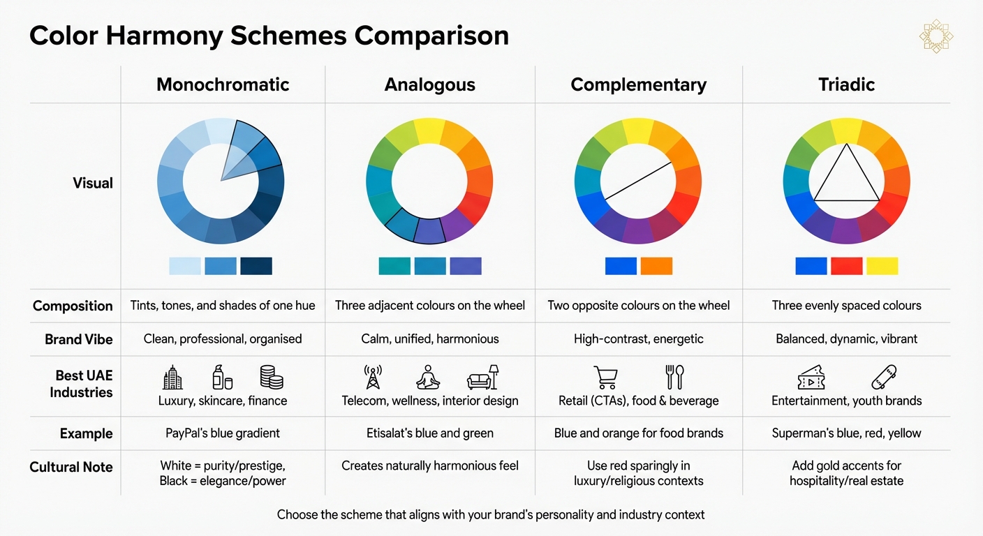
Color Harmony Schemes for Brand Identity: Comparison Guide
Understanding colour harmony is just the beginning. The next step? Picking the right scheme that aligns with your brand’s personality. Each scheme brings its own mood and purpose, helping you build a balanced and culturally sensitive brand identity.
Monochromatic Schemes
A monochromatic palette sticks to variations of a single hue – using tints (add white), shades (add black), and tones (add grey). This approach creates a clean, cohesive look. For example, PayPal’s blue gradient logo communicates trust and professionalism effortlessly.
In the UAE, monochromatic schemes are particularly effective for luxury brands. White symbolises purity and prestige, while black exudes elegance and power – perfect for high-end perfumes, watches, and skincare lines like Klur.
The challenge? Avoiding monotony. Incorporating strong neutrals like white or black can provide contrast and keep your design visually engaging. This approach is ideal for brands aiming for a minimalist yet refined aesthetic.
Analogous Schemes
Analogous schemes combine three colours located next to each other on the colour wheel – think blue, blue-green, and green. These palettes feel naturally harmonious because the hues share similar undertones.
Take Mastercard’s red and yellow overlapping circles as an example of this scheme in action. Similarly, Etisalat in the UAE uses blue and green to convey a modern yet dependable image – critical for industries like telecommunications where trust and innovation must coexist.
“Color harmony is when a group of colors looks pleasing together.” – Michael Keenan, Author, Shopify
For web design, tweaking the intensity or lightness of these hues ensures readability. This scheme is particularly suited for wellness brands, interior design, and industries that aim to create a calming, focused atmosphere.
Complementary Schemes
Complementary schemes pair two colours from opposite sides of the colour wheel, like blue and orange or red and green. These combinations are bold, high-contrast, and attention-grabbing.
The downside? High-saturation opposites placed side by side can cause visual discomfort, making text hard to read. A simple fix is to use tints or add negative space and transitional colours for balance.
In the UAE’s retail scene, complementary schemes are often used for call-to-action buttons to boost conversions. However, red should be used sparingly in luxury or religious contexts, as overuse might clash with local preferences. Blue and orange, on the other hand, work beautifully for food and beverage brands, balancing trust with appetite appeal. When applied thoughtfully, these palettes are perfect for reinforcing key messages and driving action.
Triadic Schemes
Triadic schemes involve three colours evenly spaced around the colour wheel, creating a vibrant yet balanced palette. Superman’s iconic blue suit, red cape, and yellow emblem are a classic example of this approach, evoking energy and heroism.
The trick to nailing a triadic scheme? Pick one dominant colour and use the other two as accents. Without a clear hierarchy, the design can feel overwhelming. Alternatively, muting two colours can help the dominant hue pop.
| Scheme Type | Composition | Brand Vibe | Best UAE Industries |
|---|---|---|---|
| Monochromatic | Tints, tones, and shades of one hue | Clean, professional, organised | Luxury, skincare, finance |
| Analogous | Three adjacent colours on the wheel | Calm, unified, harmonious | Telecom, wellness, interior design |
| Complementary | Two opposite colours on the wheel | High-contrast, energetic | Retail (CTAs), food & beverage |
| Triadic | Three evenly spaced colours | Balanced, dynamic, vibrant | Entertainment, youth brands |
Triadic schemes are a great fit for brands targeting younger audiences or seeking a playful, creative vibe. In the UAE, adding gold accents to these palettes can work wonders for hospitality and real estate brands, as gold signifies wealth, celebration, and exclusivity. Pairing gold with black or deep green elevates the design, making it both dynamic and luxurious – perfect for crafting a visually striking brand identity.
How to Apply Colour Harmony in Brand Identity
Now that you’ve explored various harmony schemes, it’s time to take those ideas and turn them into a practical, cohesive brand identity. Applying colour harmony isn’t just about picking colours that look good together – it’s about making deliberate choices that reflect your brand’s personality and the context in which it operates. Here’s how to bring it all together.
Selecting a Dominant Colour
The dominant colour you choose should connect directly to your brand’s core emotion or purpose. Is your brand bold and cutting-edge, warm and inviting, or calm and soothing? These traits will guide your decision.
For instance:
- Blue conveys trust and stability, making it a popular choice for tech and finance companies.
- Green represents growth and wellness, ideal for eco-friendly or health-focused brands.
- Orange exudes energy and creativity, perfect for dynamic, change-driven businesses.
- Black communicates power and sophistication, while white suggests purity and simplicity.
“Choose a base colour that represents your brand’s core emotion or functional role.” – ColourUXLab
It’s also important to consider industry norms. While you want your brand to stand out, aligning with consumer expectations is key. For example, a fintech startup in Dubai might choose blue or green to signal trust and growth, but the exact shade – like a vibrant teal or a muted navy – can help differentiate the brand.
For consistency, use specific hex codes (e.g., #151A7B) rather than generic colour names. Avoid pure black (#000000) or pure white (#FFFFFF) on digital platforms; instead, adjust white to around 90% brightness to ease eye strain. Once you’ve narrowed down your choice, gather feedback through user testing to ensure the colour evokes the intended emotional response.
Building a Balanced Palette
Once your dominant colour is set, it’s time to build a supporting palette that complements it. A great way to structure your palette is by following the 60-30-10 rule:
- 60%: Dominant colour for most design elements
- 30%: Secondary colour to complement the primary
- 10%: Accent colour for emphasis, like Call-to-Action buttons
For example, if your dominant colour is blue, a secondary colour like teal or grey could work well, while a contrasting accent like orange might add a pop of energy. The accent colour should stand out without clashing and can guide user interactions effectively.
“With your colour selection, even if it’s primarily monochromatic, there’s a lot of opportunity to inject brand personality.” – Sara Mote, Cofounder, Mote web design agency
Anchor your palette with neutrals such as white, beige, grey, or black to provide a clean foundation. To avoid overly intense backgrounds, reduce the saturation of your dominant colour by about 60%. Always document your palette’s HEX, RGB, and CMYK codes to maintain consistency across all platforms.
Ensuring Industry Fit and Cultural Sensitivity
While creating a balanced palette is crucial, aligning your colours with industry standards and local cultural nuances is just as important. Colours hold different meanings depending on regional and cultural contexts, especially in the UAE.
For example:
- Green is deeply significant in Islamic culture, symbolising paradise, peace, and nature. Use it thoughtfully and respectfully.
- Gold is associated with wealth, success, and exclusivity, making it a natural fit for luxury, hospitality, and real estate sectors when paired with darker neutrals.
- Red can be a strong accent colour but should be used sparingly in luxury or religious contexts, as it can signal caution or danger when overused.
- White represents purity and prestige and is often favoured in modern, minimalist designs.
To ensure your palette resonates, test it with local audiences. Converting your design to greyscale can help confirm adequate contrast, especially for accessibility purposes. Keep in mind the UAE’s diverse population, which includes Emirati nationals, South Asians, and Western expats, each with unique cultural associations with colour. Your palette should respect this diversity while maintaining a consistent brand identity across all channels.
Brand Husl‘s Approach to Colour Harmony

Brand Husl takes colour harmony beyond aesthetics, crafting palettes that align with a brand’s identity and resonate with the UAE’s cultural landscape. For them, colour is not just about decoration – it’s about positioning. Every shade is chosen with purpose, reflecting the brand’s archetype, audience, and the cultural nuances of the UAE market.
Custom Palette Development
The process begins by anchoring colours to the brand’s archetype, ensuring that the palette mirrors the brand’s emotional essence. This strategy avoids random choices, instead tying every colour to the brand’s DNA and its strategic goals.
Using the HSL model, Brand Husl generates cohesive colour families from a single base shade. This method allows for precise adjustments and ensures all colours work harmoniously together. Palettes are divided into primary, secondary, and neutral categories, ready for application across various mediums – whether it’s a website, a billboard on Sheikh Zayed Road, or product packaging. Each colour is meticulously documented with HEX, RGB, CMYK, and Pantone codes to maintain consistency across platforms.
Cultural relevance is a priority. For UAE-based brands, colours like green (symbolising Islamic heritage), gold (representing prestige), and white (associated with purity) are thoughtfully incorporated to reflect Emirati values. Seasonal adjustments are also made, with palettes tailored for occasions like Ramadan or National Day, ensuring brands remain relevant and connected to local sentiments.
Once the palette is set, the focus shifts to ensuring it is applied effectively across all brand touchpoints.
Implementation Across Touchpoints
After finalising the palette, Brand Husl ensures its smooth integration across every brand interaction – from digital platforms and in-store displays to event branding and marketing materials. The agency rigorously tests all colour combinations against WCAG accessibility standards, achieving a minimum contrast ratio of 4.5:1 for text to ensure usability for individuals with colour vision deficiencies.
Greyscale testing is also part of the design process, verifying contrast and readability across all elements. By maintaining consistent application across both Arabic and English platforms, Brand Husl addresses the UAE’s diverse audience while preserving visual balance. This thoughtful approach ensures that colour not only enhances the brand’s appearance but also strengthens recognition and trust at every customer touchpoint.
Conclusion: The Impact of Colour Harmony on Brand Success
This guide highlights how colour harmony serves as a cornerstone of effective brand identity. It’s not just about making things look good – it’s a powerful tool that influences perception, builds trust, and enhances recognition. Studies show that 62%–90% of a consumer’s first impression happens within 90 seconds, with colour playing a major role. Consistent and harmonious colour use across all brand touchpoints can boost recognition by as much as 80%.
In the UAE’s diverse market, where cultural nuances hold significant weight, the role of colour harmony becomes even more pronounced. Brands need to blend universal psychological triggers with culturally significant colours like green, gold, and white to resonate with Emiratis, South Asian residents, and Western expats alike. This thoughtful approach ensures brands connect meaningfully with the region’s multicultural audience.
The advantages of colour harmony go far beyond aesthetics. A well-balanced palette reduces visual clutter, enhances user experience, and fosters emotional connections that turn casual visitors into loyal customers. Additionally, designs that meet contrast standards have been shown to increase engagement by 78% for users with vision differences, ensuring inclusivity for all potential customers.
“Colour is not decoration. It is a business signal.” – Haris Ali D., Co-Founder, FullStop
Whether you’re building a new startup in Dubai or crafting a luxury brand in Abu Dhabi, colour harmony lays the groundwork for a memorable, trustworthy, and culturally aligned brand identity. It’s your key to standing out in a competitive market.
FAQs
How do I choose my brand’s main colour?
Choosing the main colour for your brand is about more than just aesthetics – it’s about aligning with your brand’s message, evoking the right emotions, and connecting with the audience on a deeper level. Start by pinpointing the message you want your brand to convey. For instance, blue often represents trust and reliability, while red can evoke passion or energy.
To ensure your colour choice is visually appealing, explore harmony models like complementary or analogous schemes. These approaches help create a balanced and pleasing design that draws attention without overwhelming.
For brands in the UAE, it’s essential to consider local associations with colours. Certain hues carry specific meanings or significance within the region, and aligning with these can help your brand resonate more strongly with the audience. A well-thought-out colour choice not only makes your brand visually distinctive but also ensures it communicates effectively with the people you aim to reach.
Which colour scheme fits my brand best?
The best colour scheme for your brand hinges on its personality, the audience you’re targeting, and the emotions you aim to evoke. For example, complementary schemes – like blue and orange – offer contrast and energy, making them ideal for promotional materials. On the other hand, analogous schemes – such as teal, blue, and indigo – create a calming effect, which works well for backgrounds. Choose colours that reflect your brand’s identity and maintain consistency across all your designs.
How do I keep colours consistent in print and digital?
To keep your colours consistent across both print and digital platforms, rely on established harmony models like complementary or analogous schemes to design well-matched palettes. Stick to the same colour codes – such as Pantone, HEX, or CMYK – and utilise tools that support ICC profiles for accurate standardisation. By referencing a unified colour palette, you can minimise discrepancies and ensure your brand’s visual identity stays consistent across all formats.
Related Blog Posts

BRAND HUSL
We’re a collective of brand strategists, designers, and unapologetic truth-tellers who’ve spent over two decades turning chaos into clarity for businesses across the globe. From global names to fearless startups, we’ve built brands that stick, scale, and sell—without the fluff. Everything we create is rooted in strategy, storytelling, and ROI, because good branding isn’t just pretty—it’s powerful.